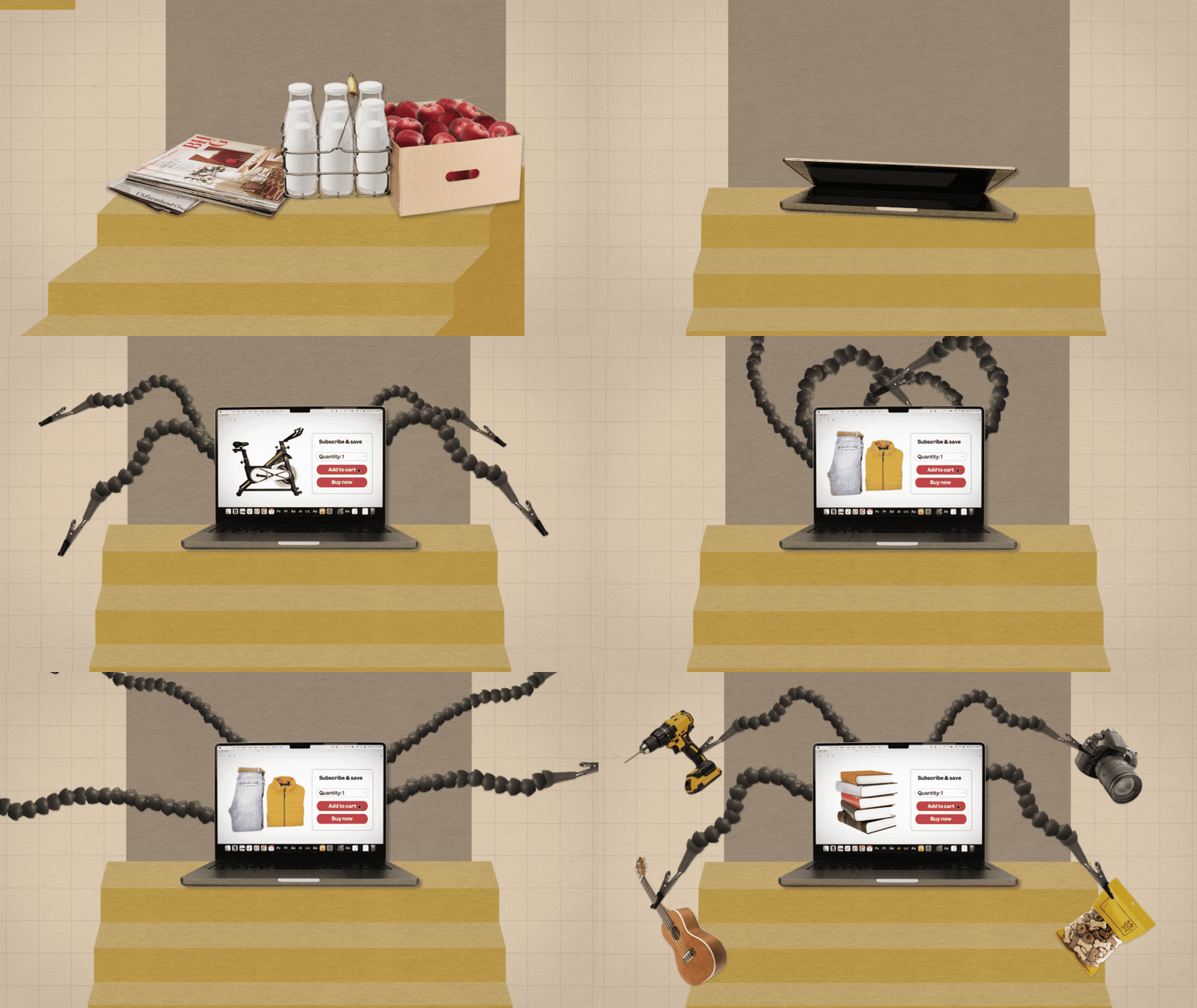
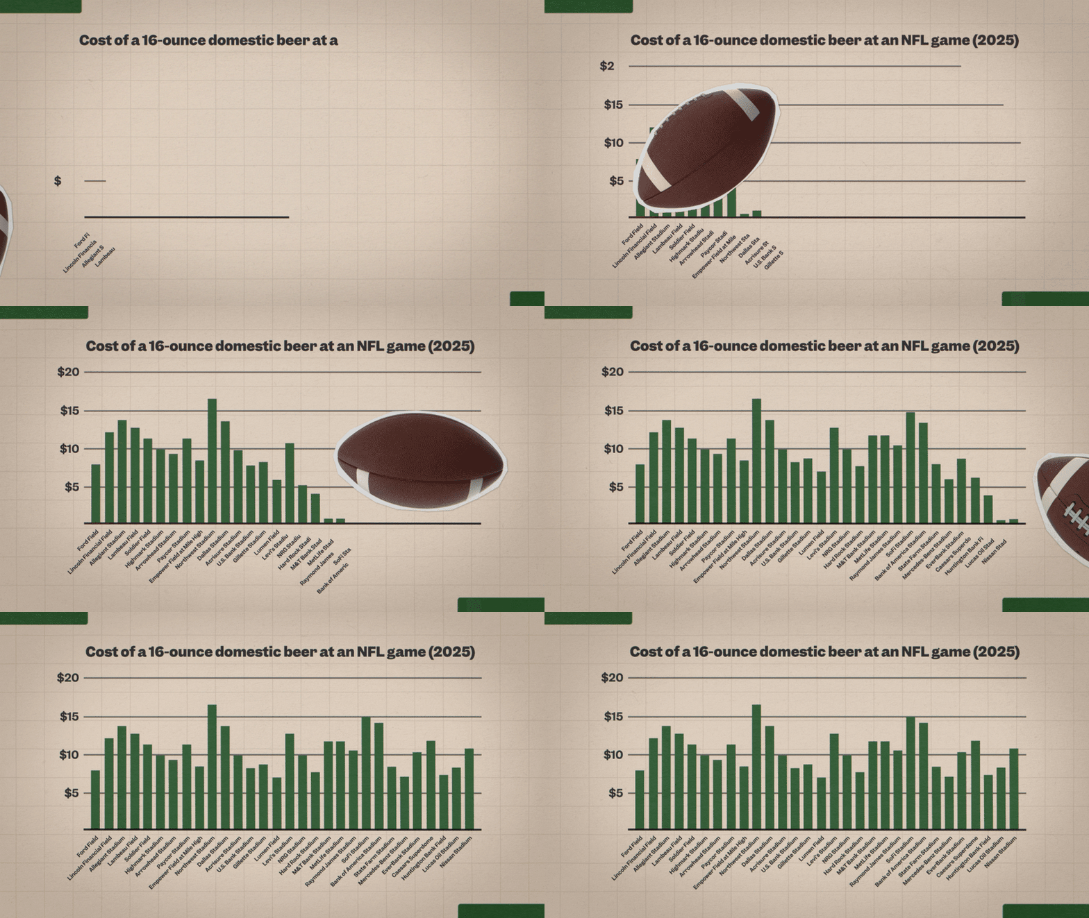
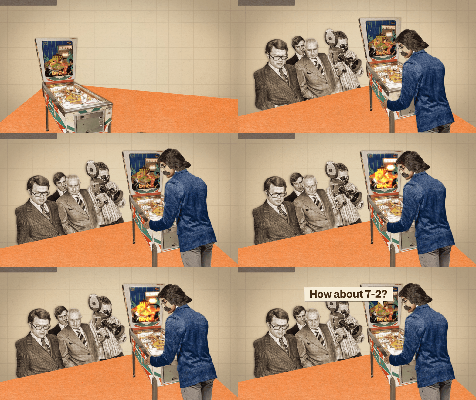
BUSINESS INSIDER | SO EXPENSIVE - LEAD MOTION DESIGNER & ART DIRECTOR
With eight seasons, So Expensive is one of Business Insider’s longest-running series. While I was the lead motion designer of the team, two episodes I worked on were nominated for a News & Documentary Emmy Award and for a Webby Award.
Before I joined as a lead animator on the series, the animations were made by a video editor or motion design fellow. Since the series featured a lot of numbers, most times these animations were simplistic text on screen and vectors. As the animations on the video team evolved, So Expensive was in desperate need of a redesign. Having designed and created the graphics packages and redesigns of other shows, I was just the person for the task.
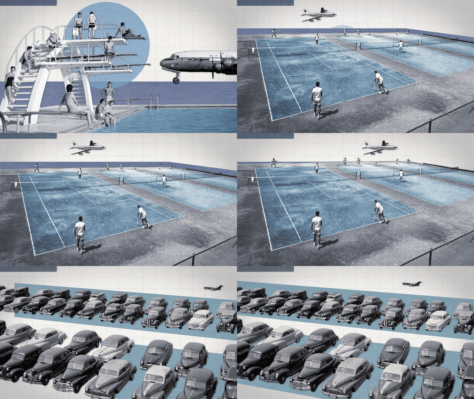
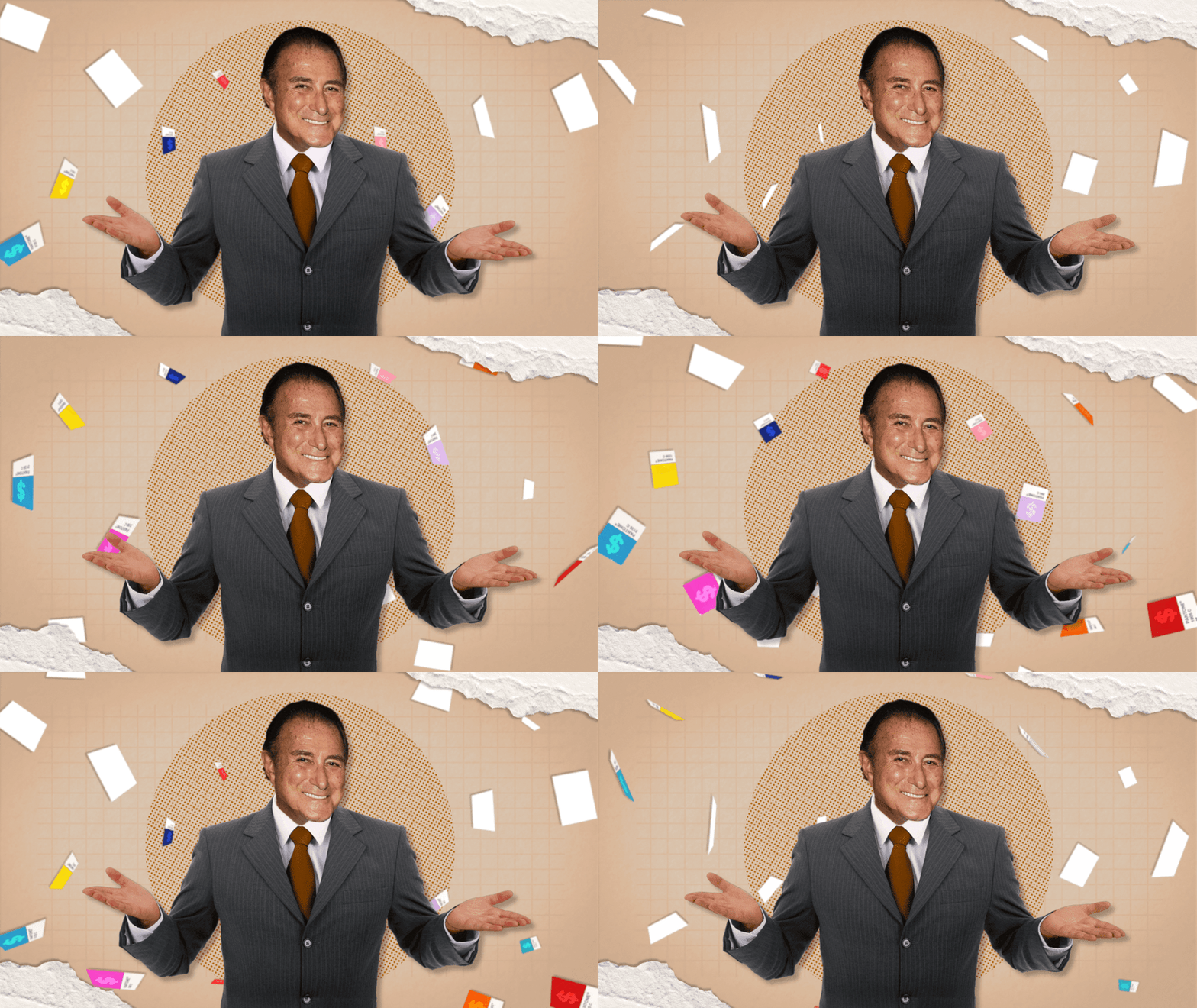
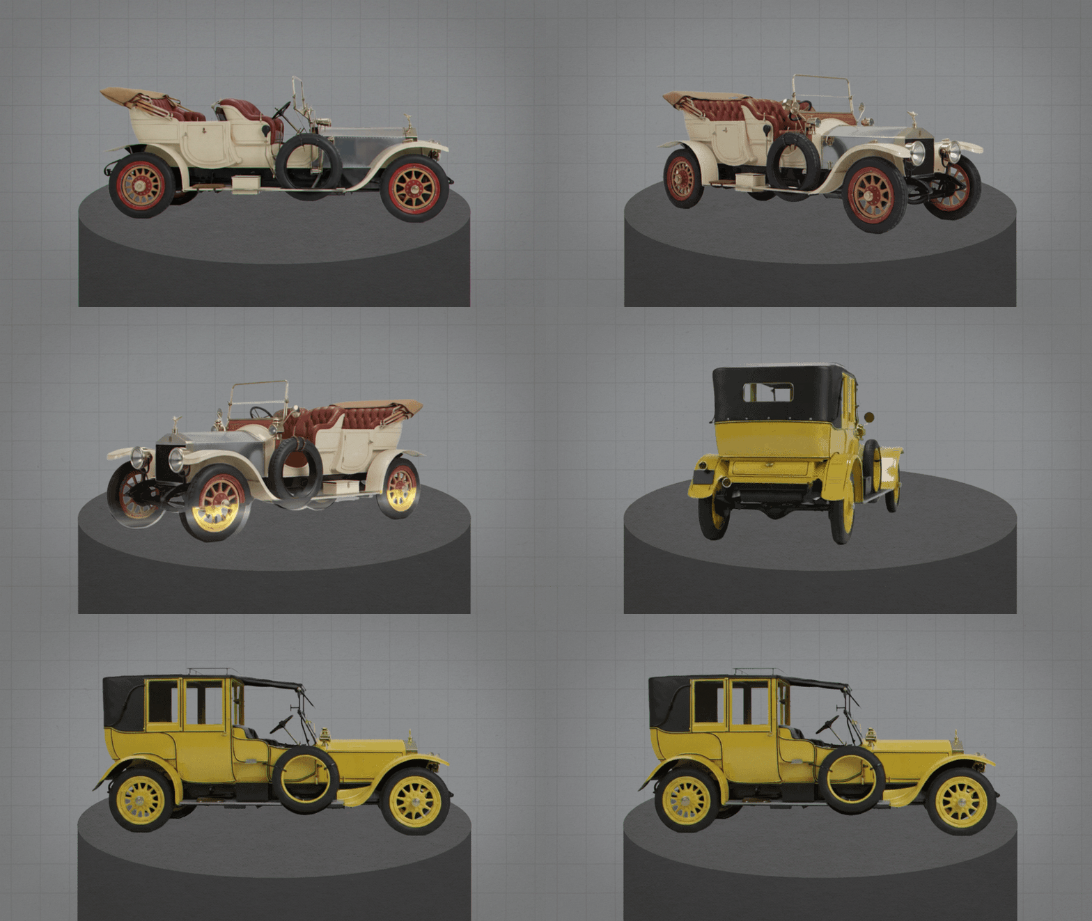
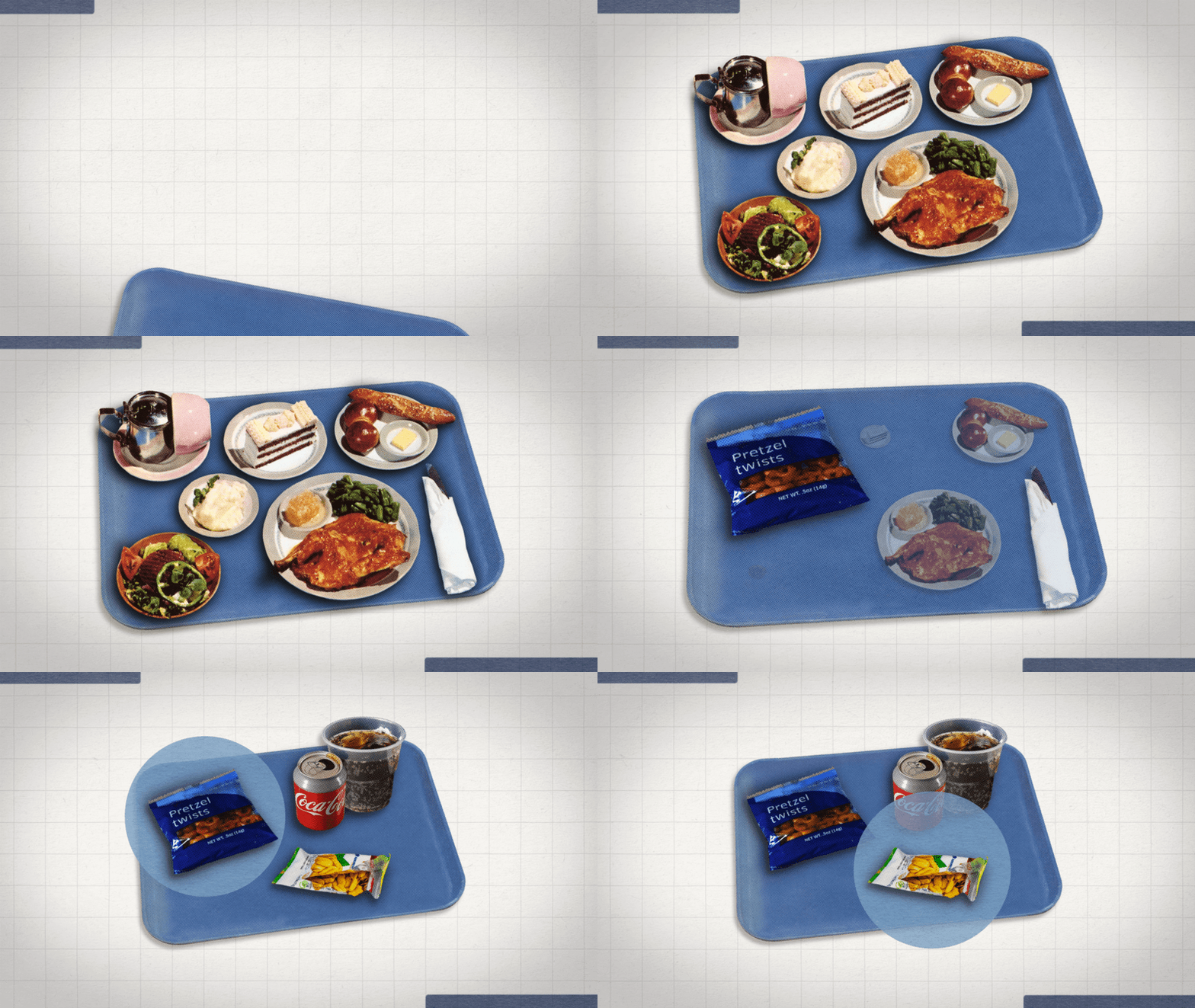
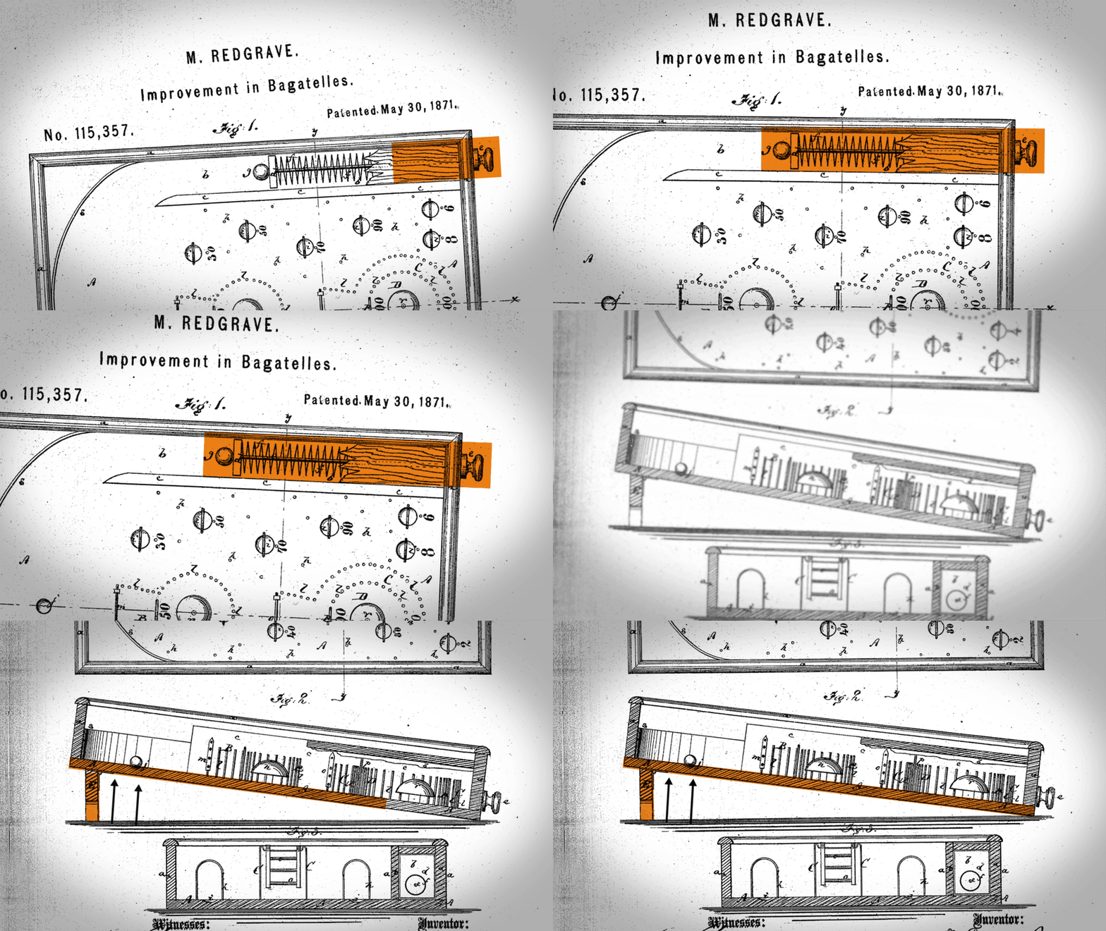
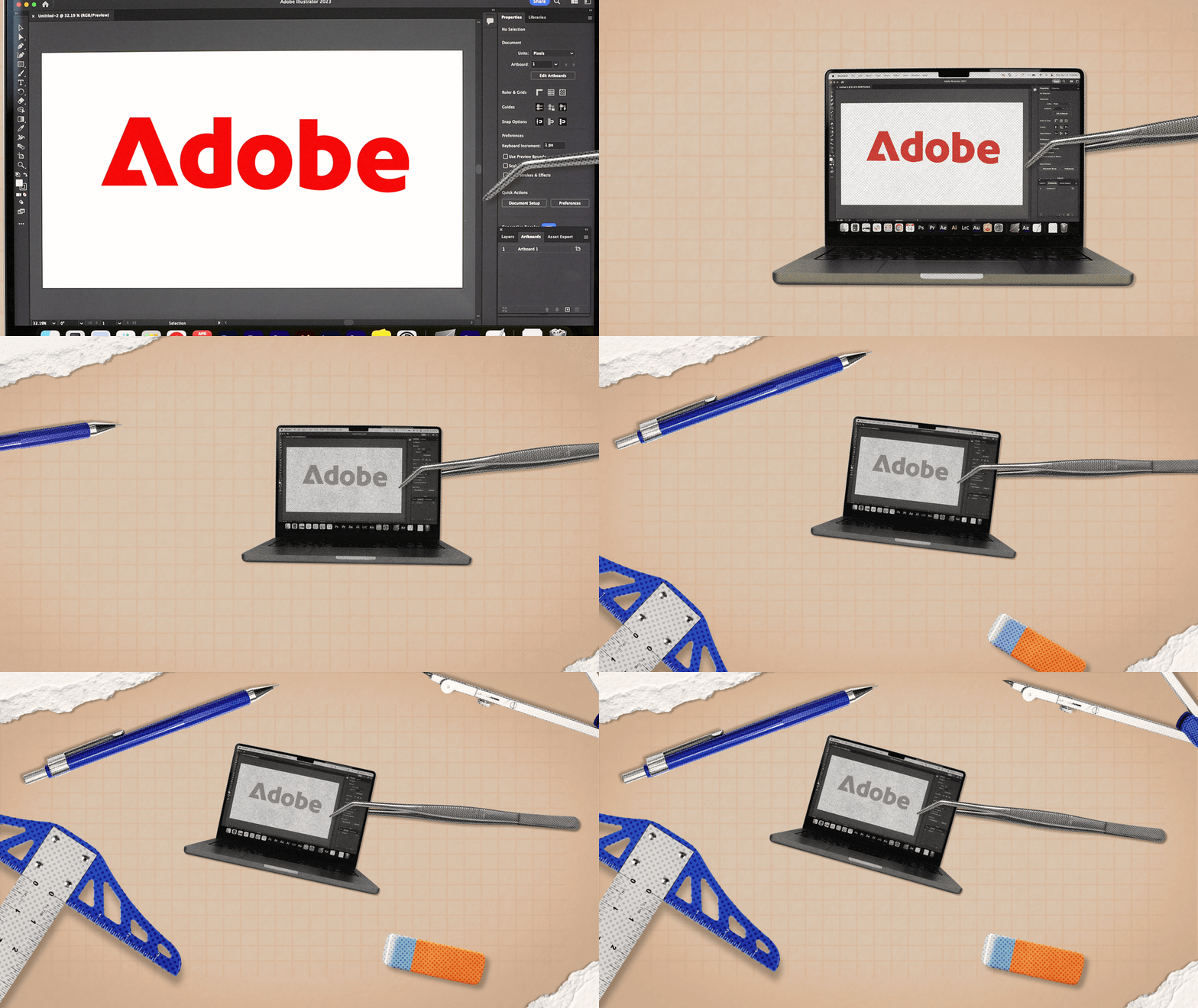
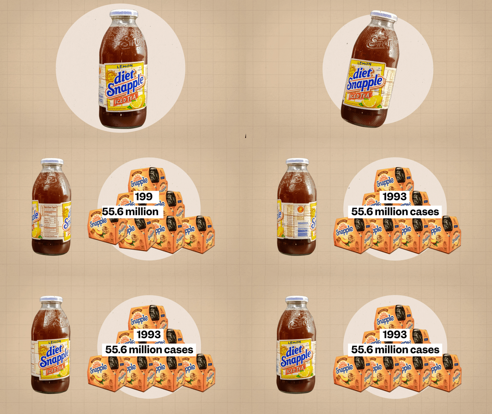
With the So Expensive and Still Standing teams combining, I set out to find a way to align the designs for both series. My solution was to use the photo cut-out collage style from Still Standing and the simplistic text on screen from So Expensive for both series. Each would then keep their respective themed backgrounds since those were the more recognizable feature for each series.
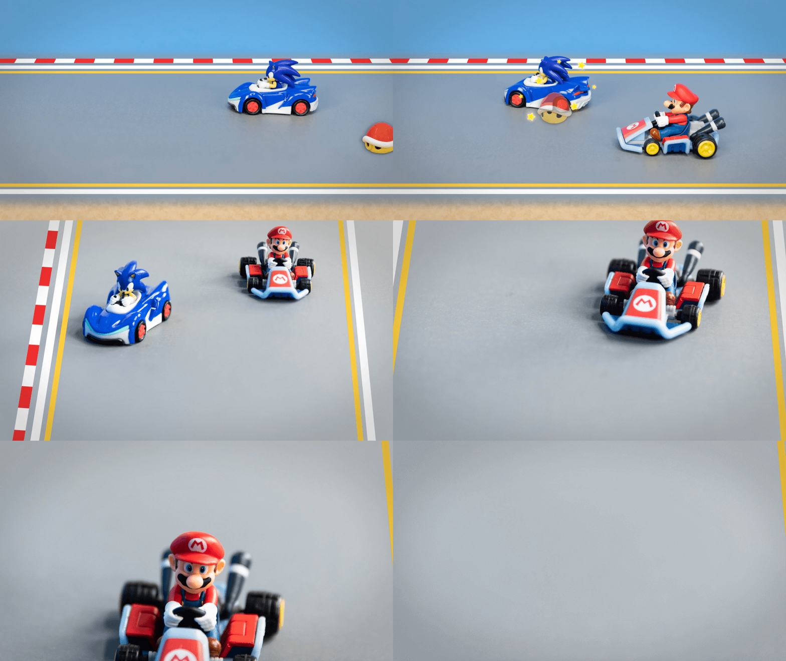
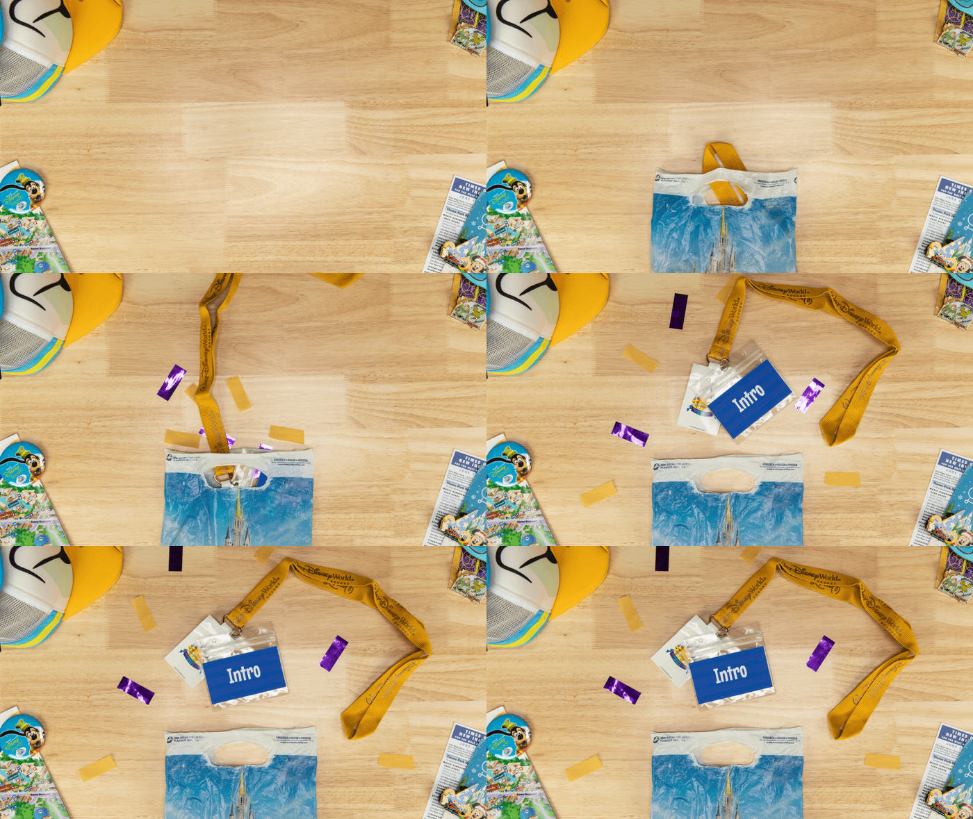
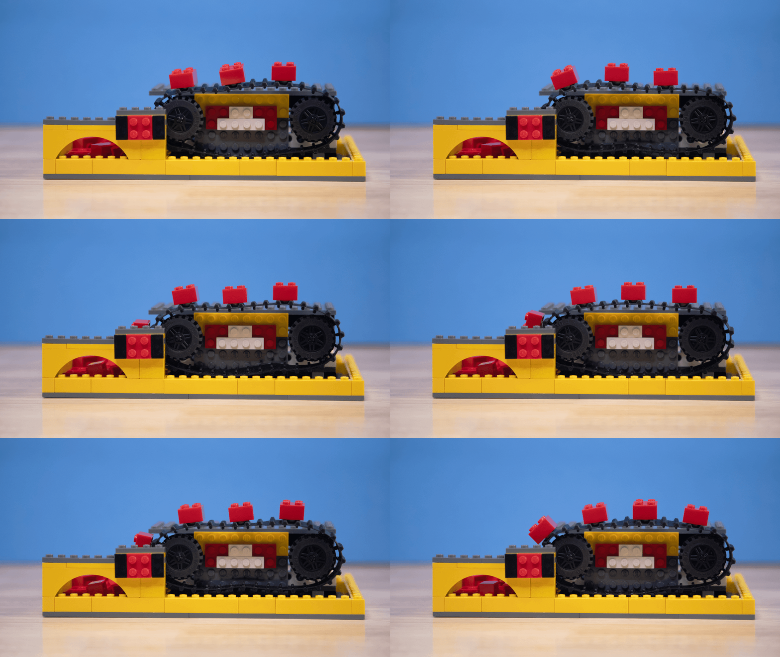
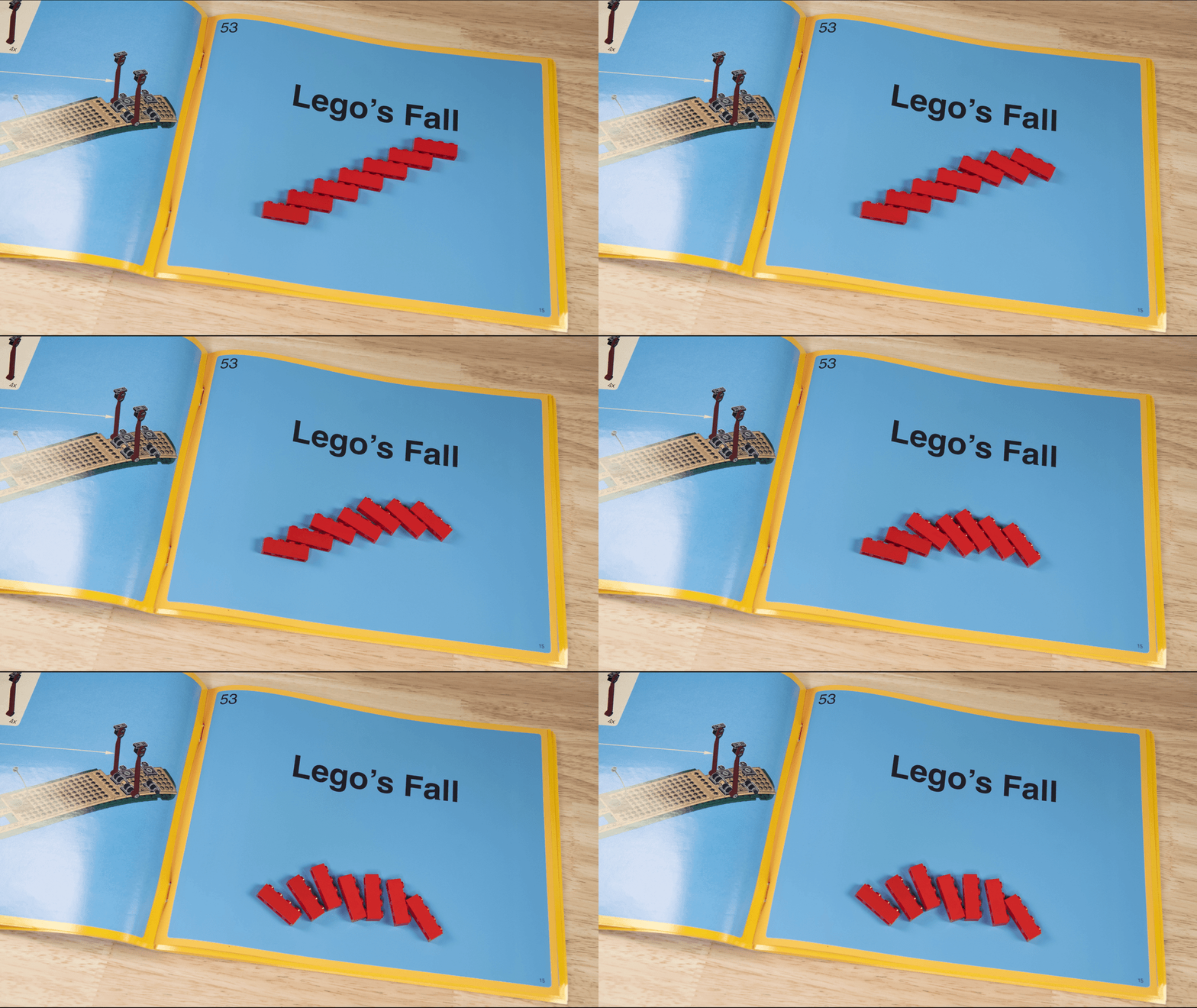
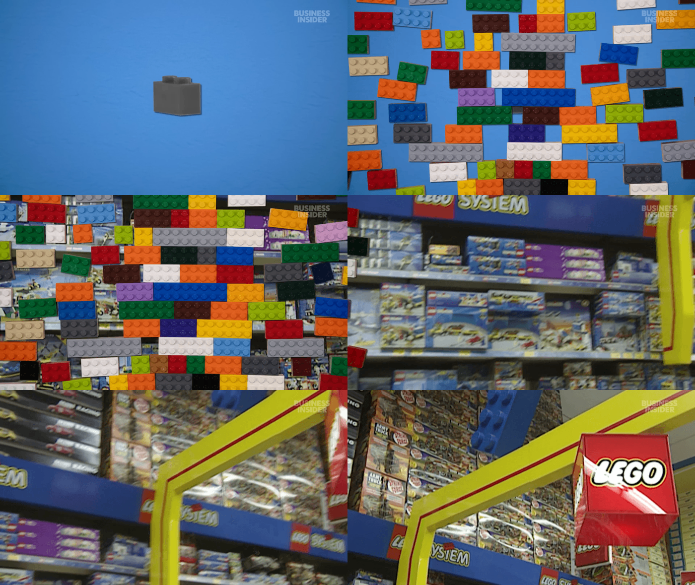
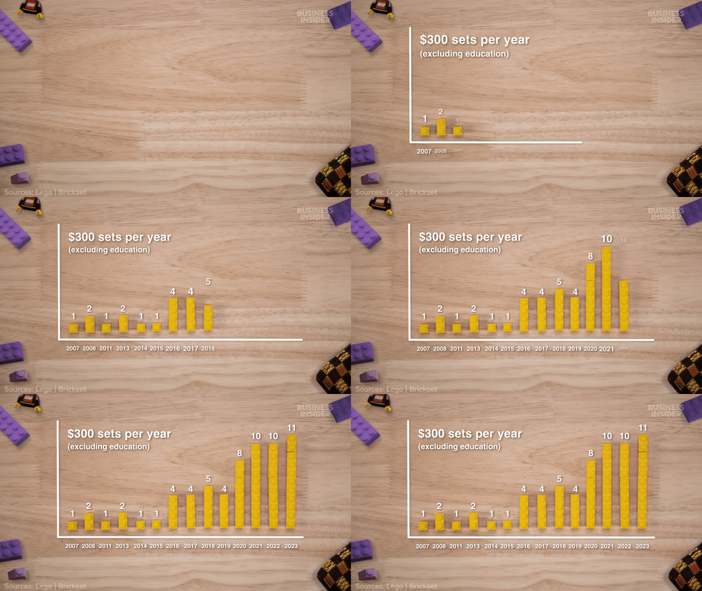
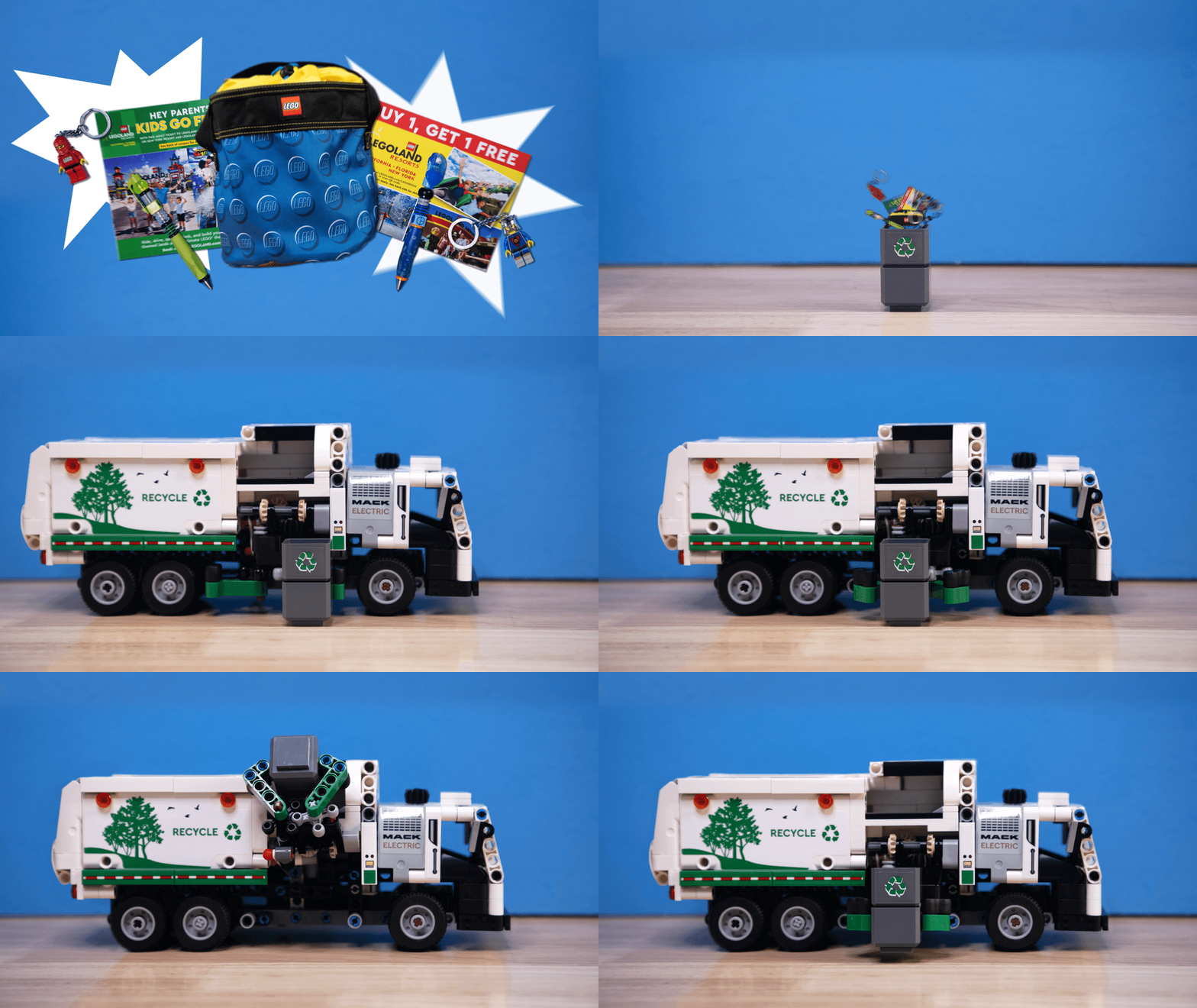
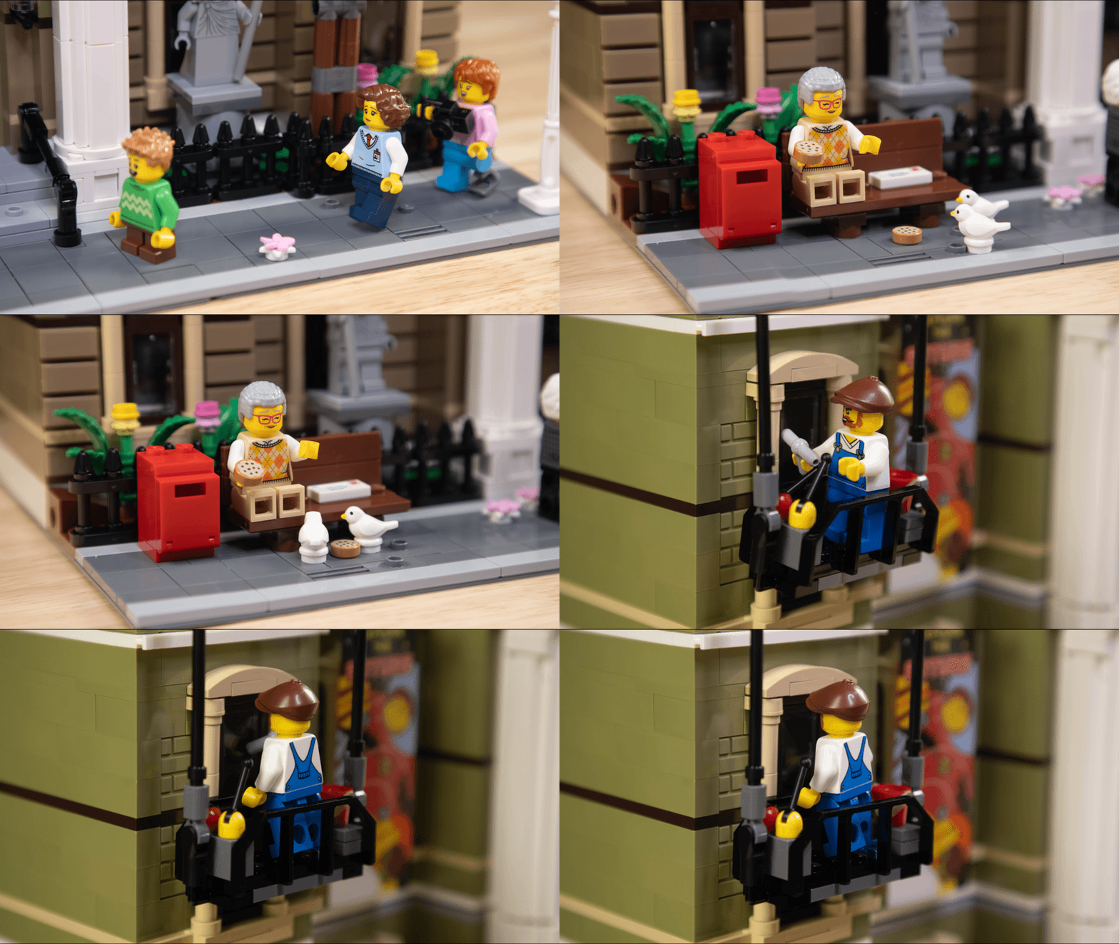
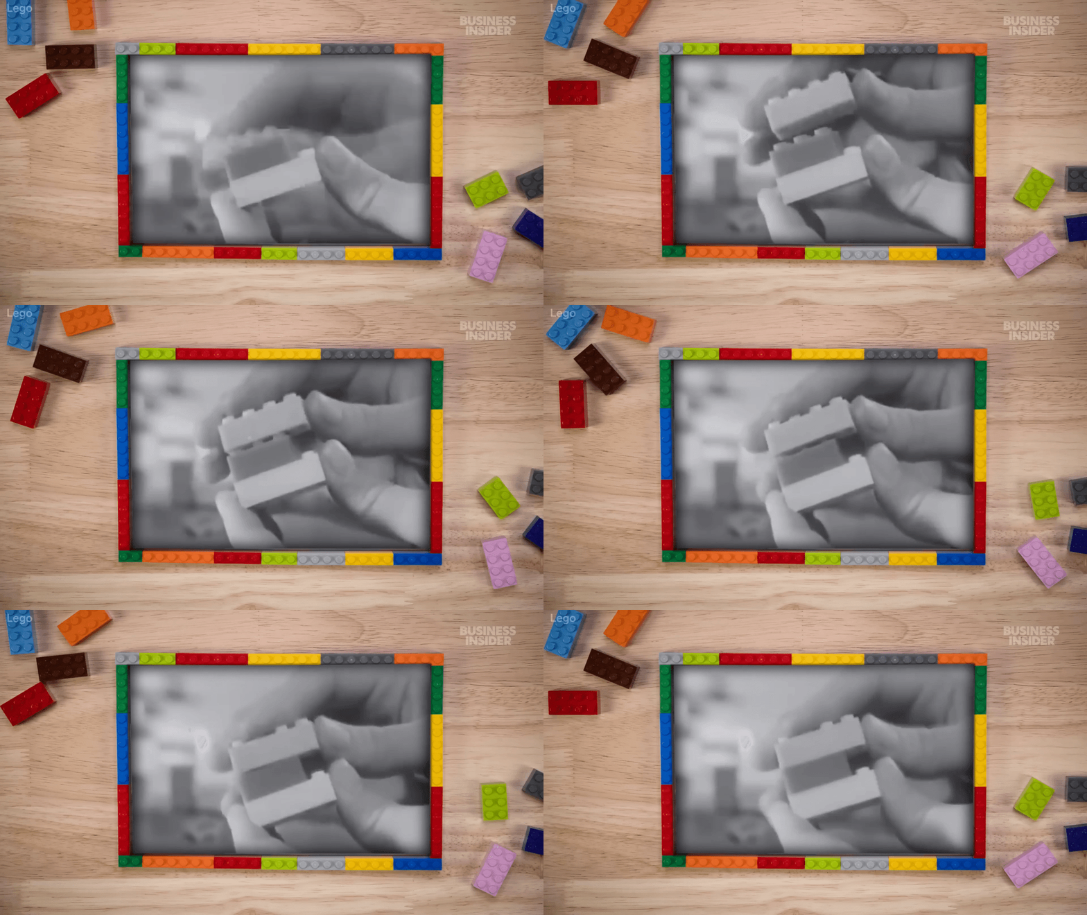
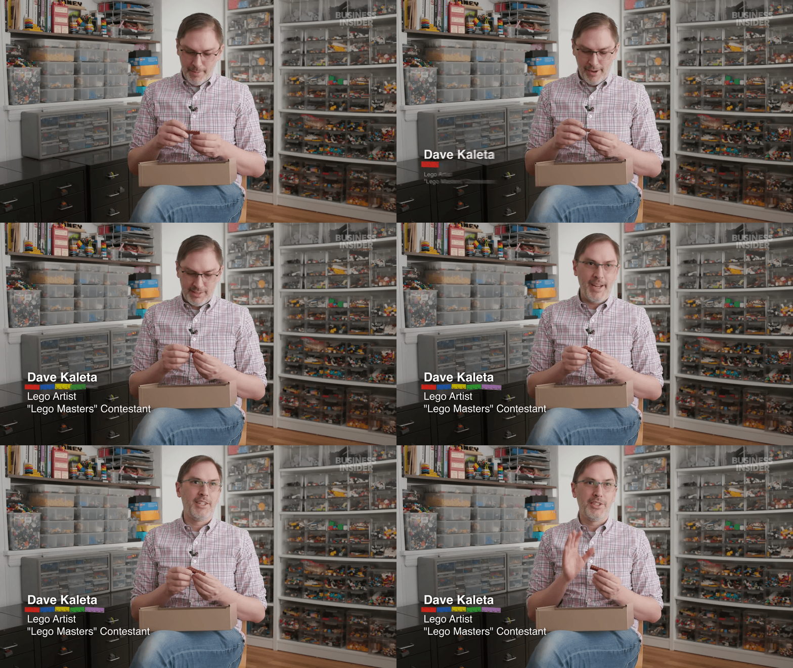
A pivotal project that changed the visual approach across the video team was when I pioneered stop motion animation for a video about Lego (which was nominated for a Webby Award).
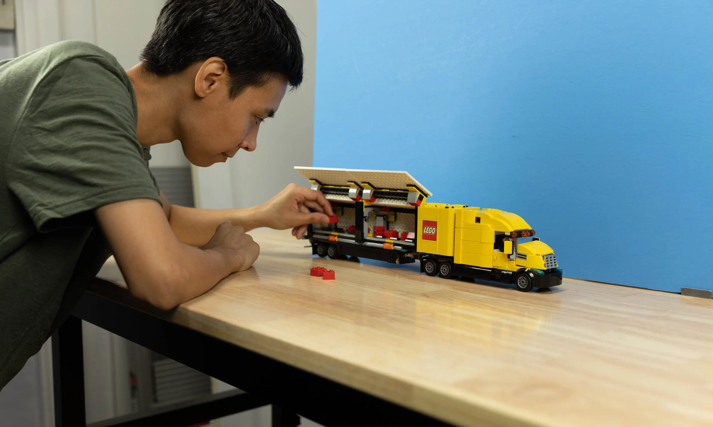
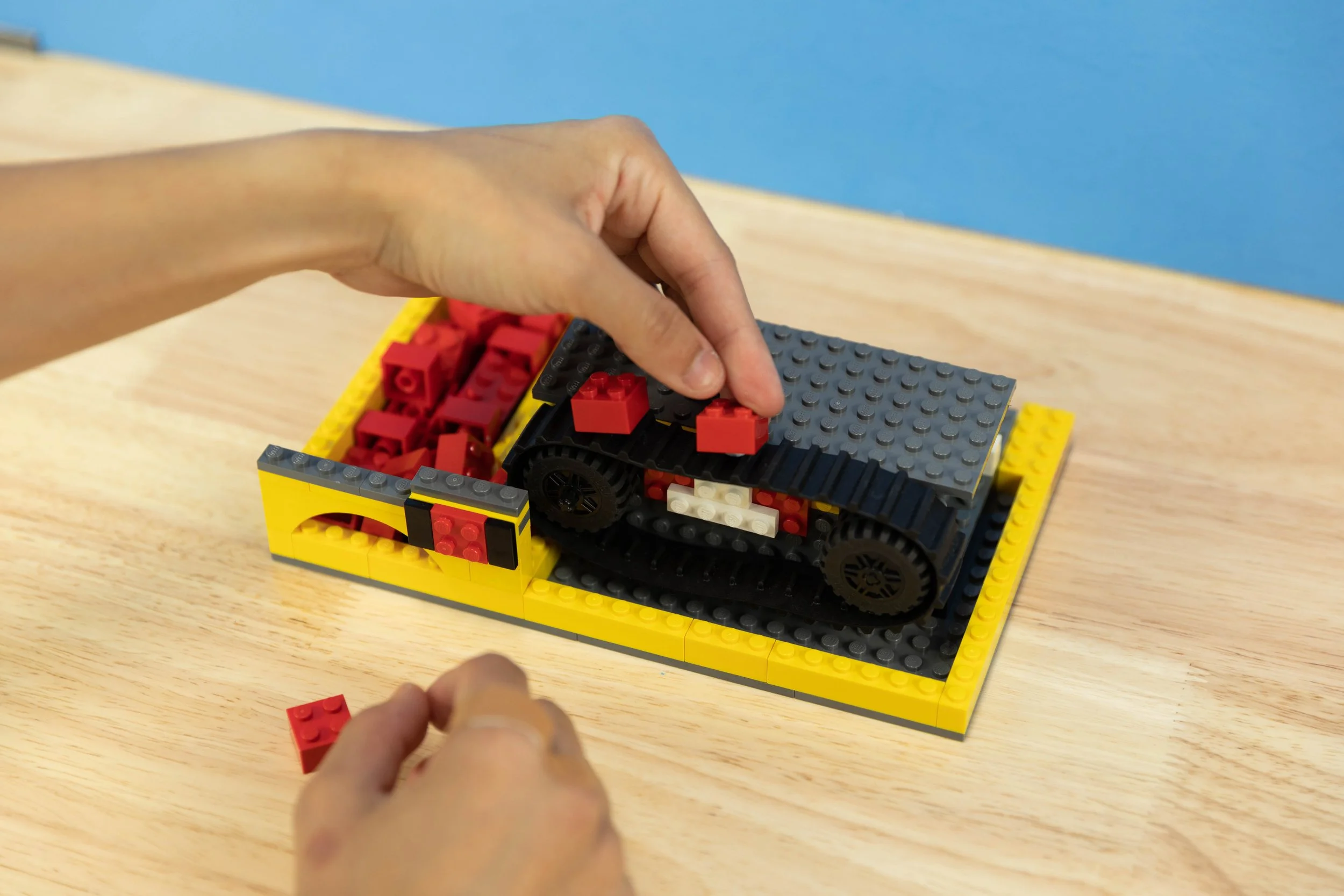
Being a huge Lego fan myself with a bunch of sets at my disposal, I pitched some stop motion ideas for chapter cards, text on screen, transitions, the history and explainer animation sections and b-roll of props. The lead producer gave the green light and we coordinated our setups since we were both filming with Lego props remotely. It was truly a lucky thing that we both had the same color wooden table in our home studios. From then on his wooden table and prop setup and my stop motion animation approach have been adopted across the video team as a creative way to supplement visual gaps that don’t necessarily need to be animations. It really brought Business Insider’s videos to a whole new storytelling level.
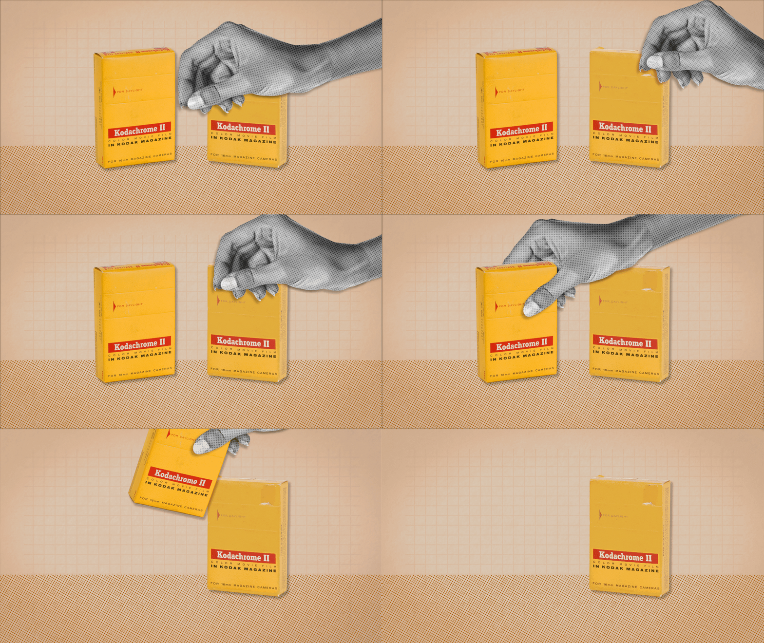
Not long after, Business Insider was looking to have their video graphics match their new branding. Tasked with finding a visual style to match their website, I used So Expensive animations as my testing ground. My first experiment was with the Pantone episode. I drew inspiration from Vox’s YouTube series and from Business Insider’s own article thumbnails. I wanted to give more polish to our photo cut-out collages and adopted more of a minimalist approach that used shapes as highlights and to give more visual appeal to the photos. I paired those with a grid background that didn’t quite reach the edges of the frame much like Business Insider’s article thumbnails. It was a good mix of both past and present visual styles so it became the basis for the video team’s animations today.