BUSINESS INSIDER | VIDEO TEAM STYLE GUIDE - ART DIRECTOR

Towards the end of 2023, Business Insider rebranded. They reclaimed their name, updated their logo, and shifted away from the Insider Inc. branding. An outside company worked with them to create their new brand book with stylistic rules for the website. It wasn’t until spring of 2025 that the video team was finally catching up with that. My fellow senior motion designer Dorian Barranco and I were tasked with pitching ideas for the video team’s visual style guide.

Text On Screen
For text on screen, Dorian mimicked the way text was animated on the website. Once it was approved, I made MOGRT versions and designed and built out the rest of the graphics and MOGRTs with that same in/out animation.

Dorian’s lower thirds animation that was the basis for the rest of the text on screen animations.

Instead of using a horizontal line like the website, we opted for a vertical line.

Transparent and multi-color box versions were created for each text on screen MOGRT.

I added this square point to some text on screen and map elements to match the boxes/lines.
Visual Style
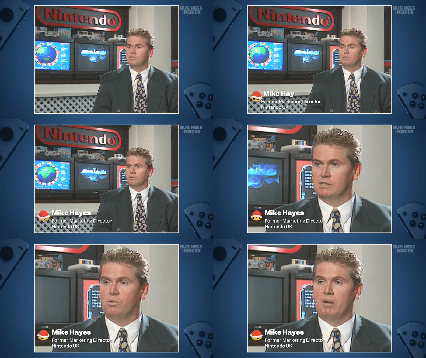
For a universal visual style across series, I drew inspiration from Business Insider’s Facebook page’s article graphics, from Still Standing (which I was the lead on) and Big Business (which Dorian was the lead on), and from Vox’s YouTube series.
I kept the grid background and shapes from Big Business and the paper textures and collage cut-outs from Still Standing and combined it with Vox’s occasional minimalist design layouts. The new branding had thinner line weights, thicker text, and a more centralized color palette. Each series would use these same graphical and stylistic elements to establish brand consistency.
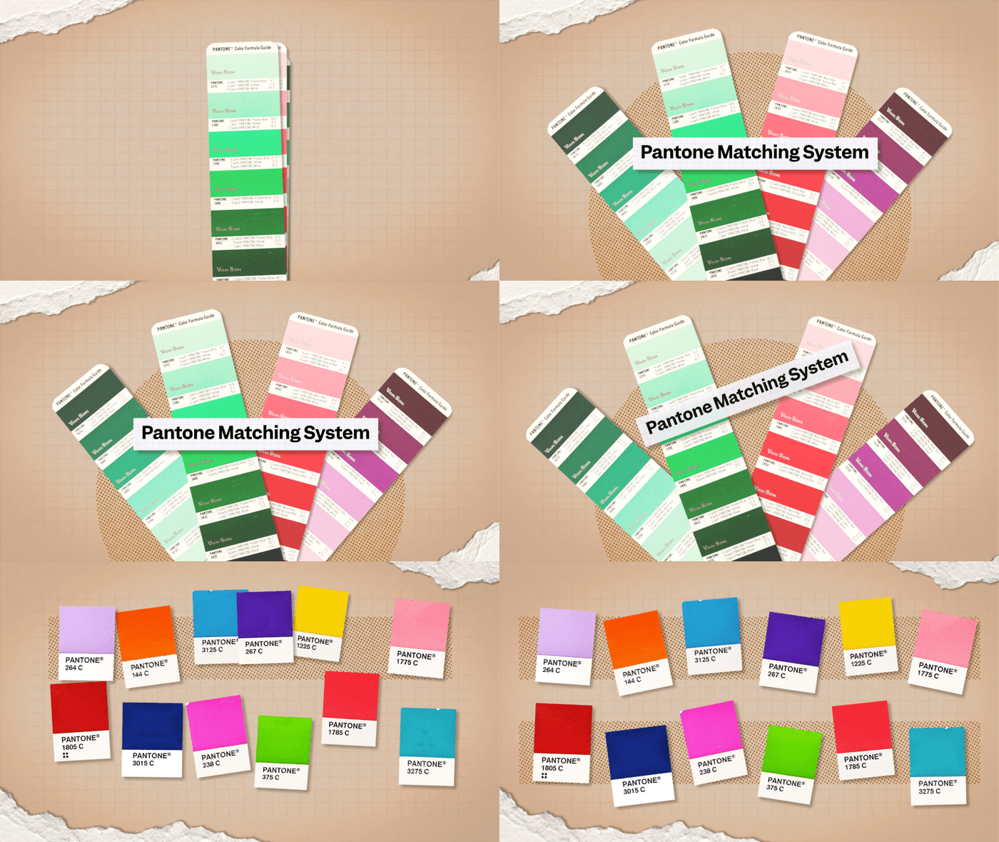
So Expensive
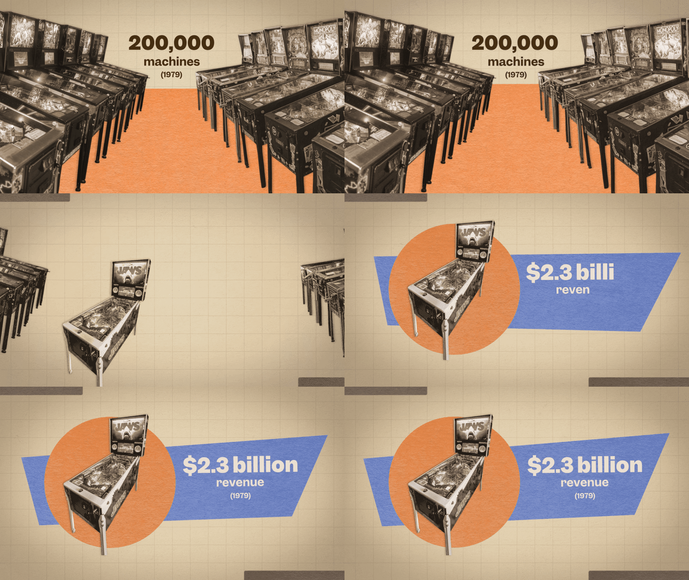
Still Standing
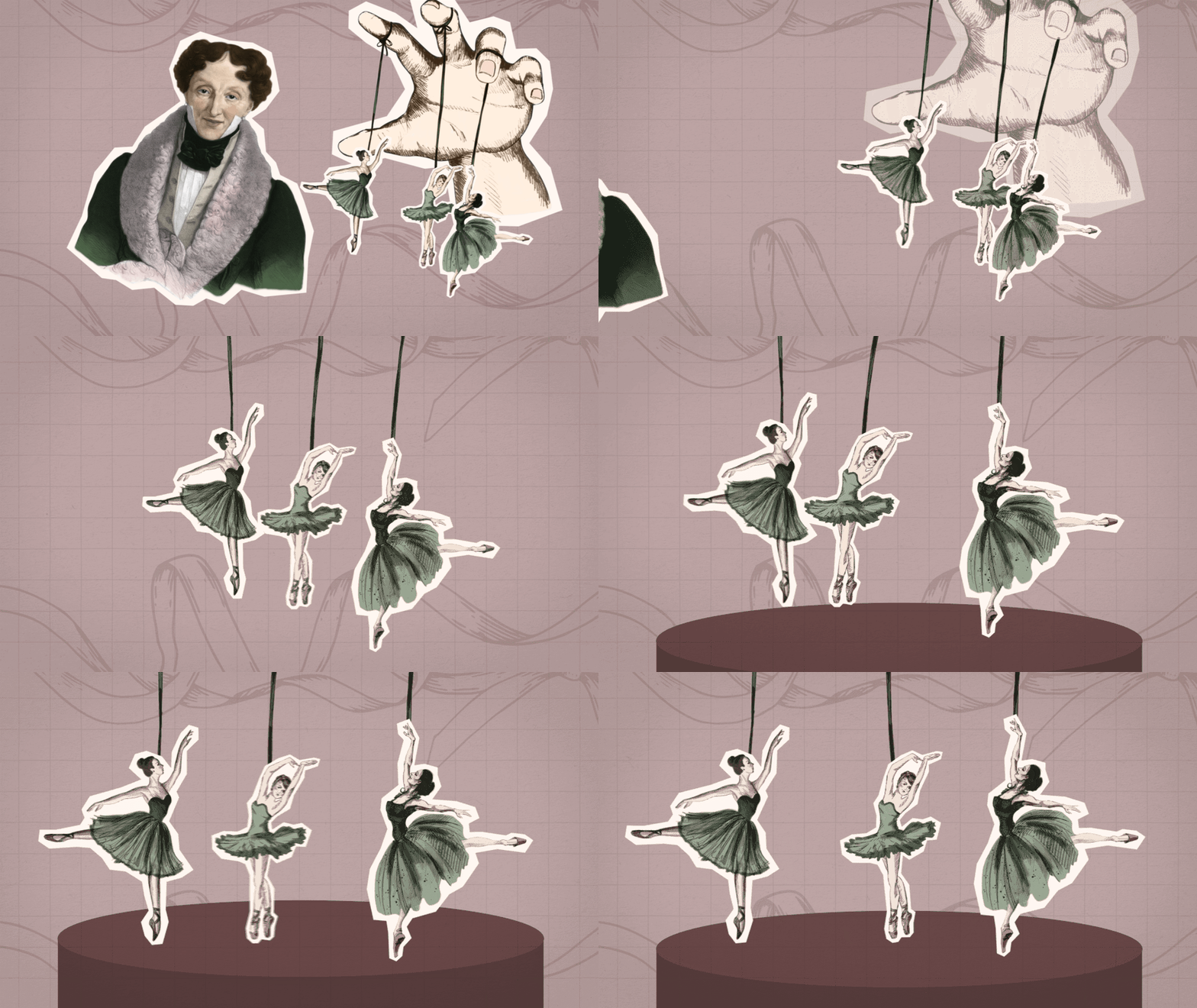
Big Business
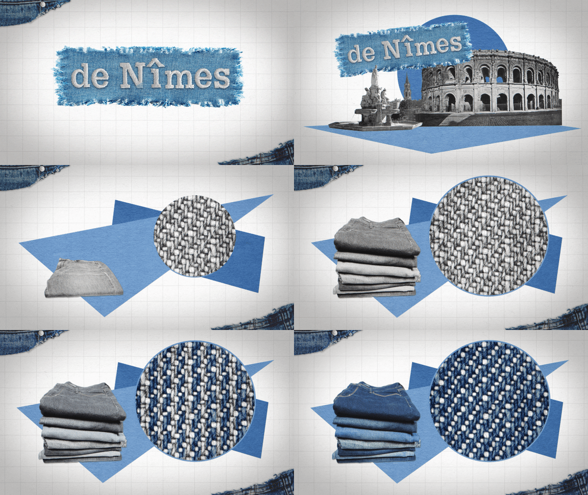
Made In America
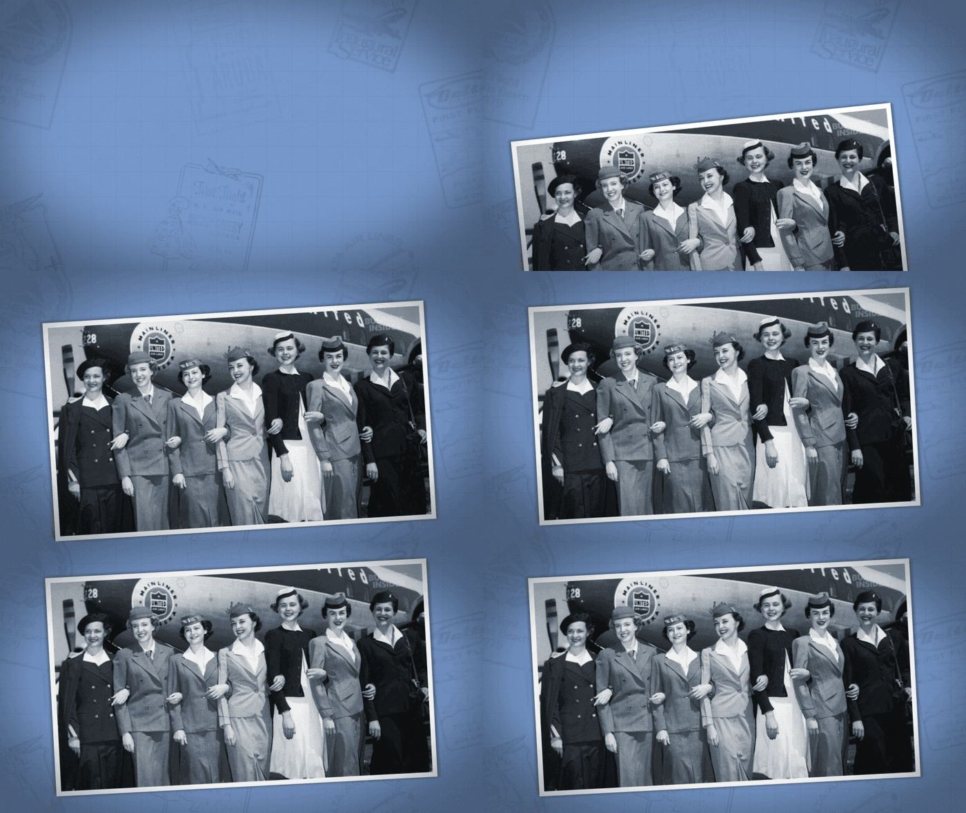
Footage/Photo Treatments
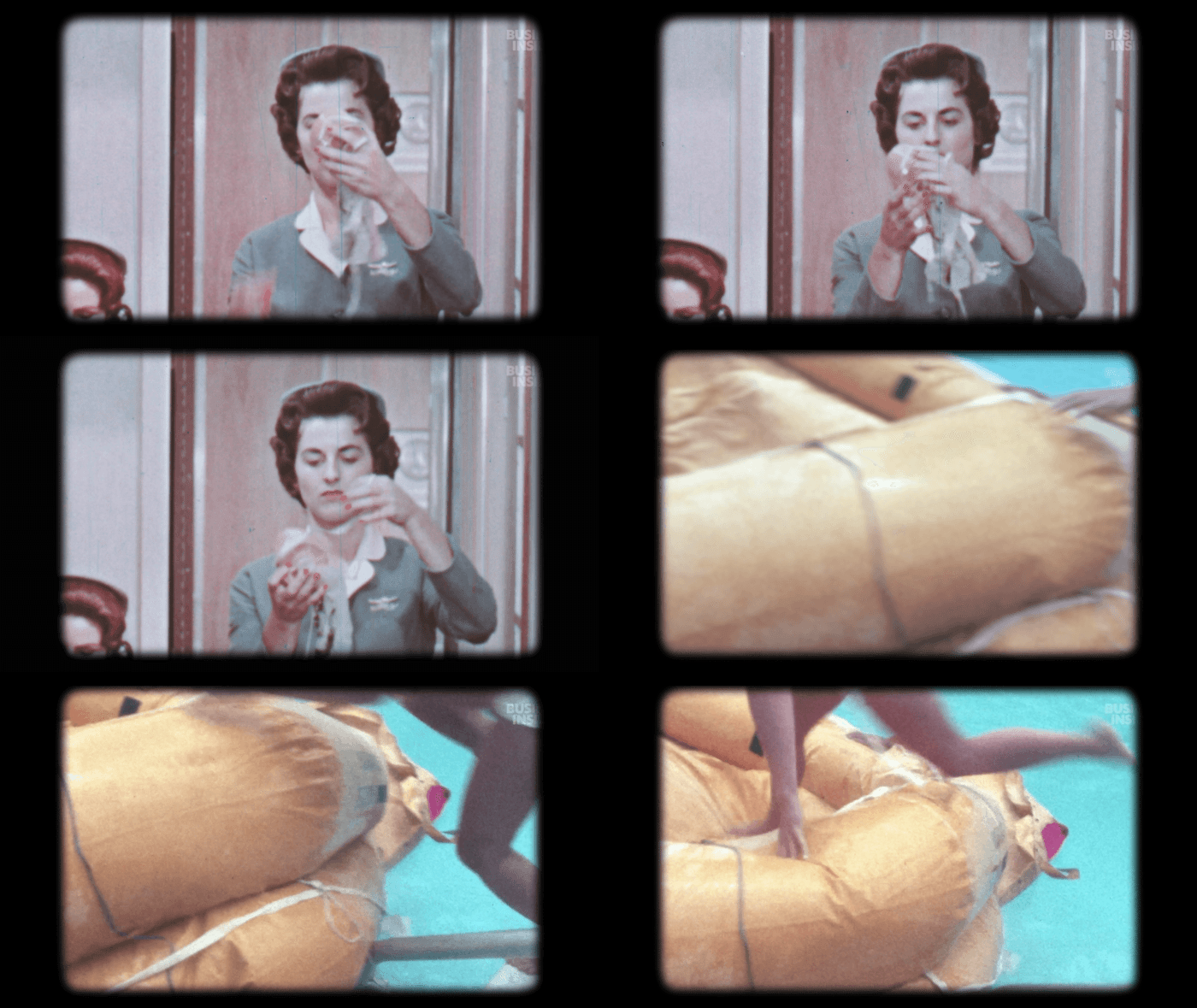
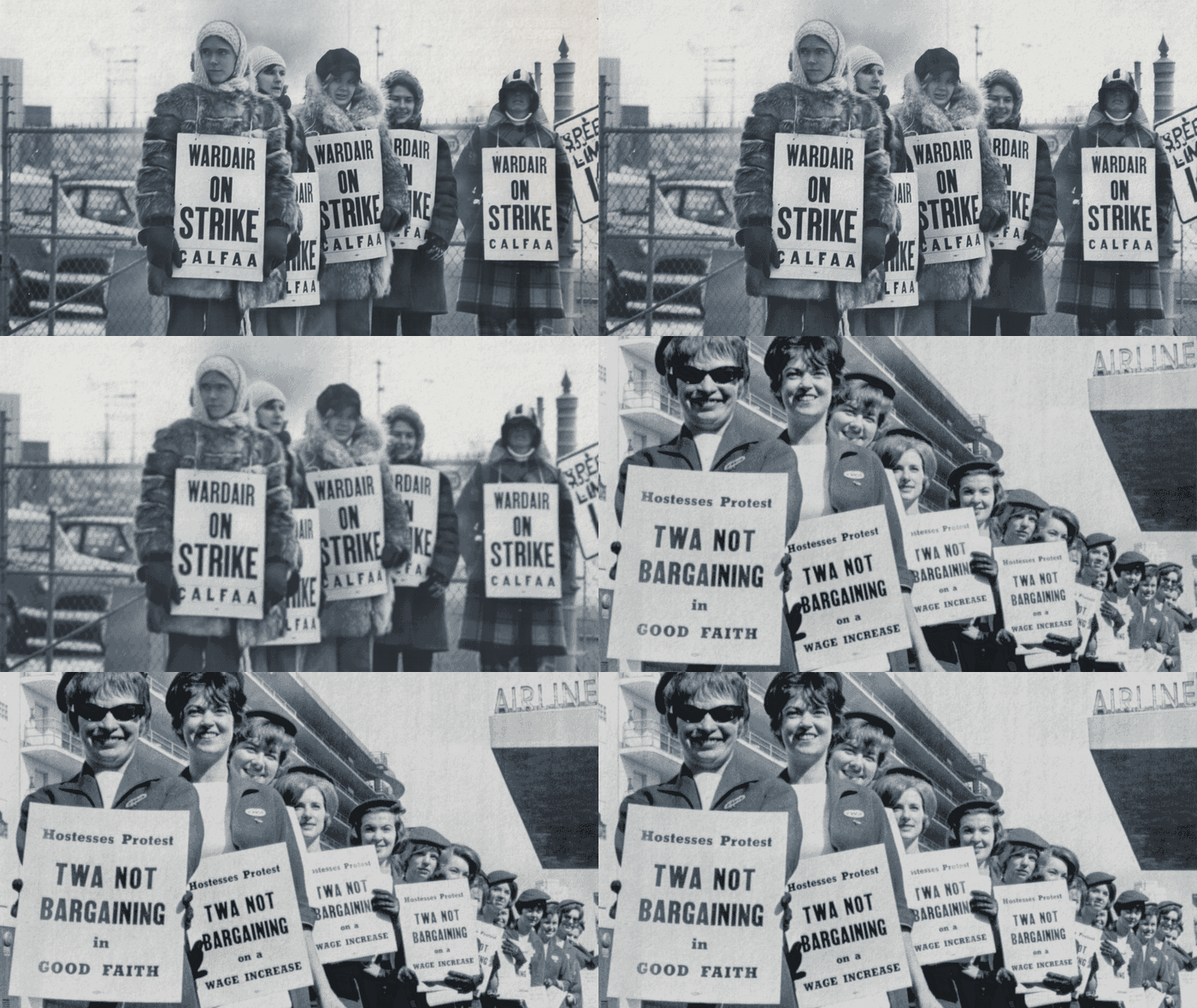
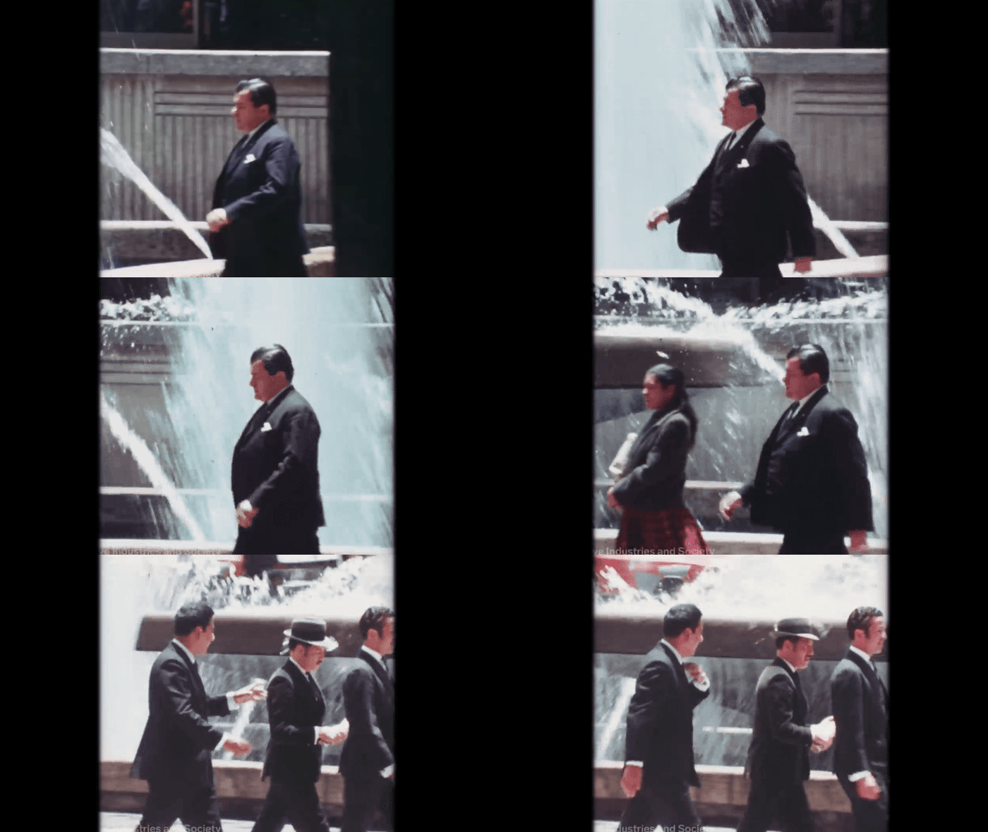
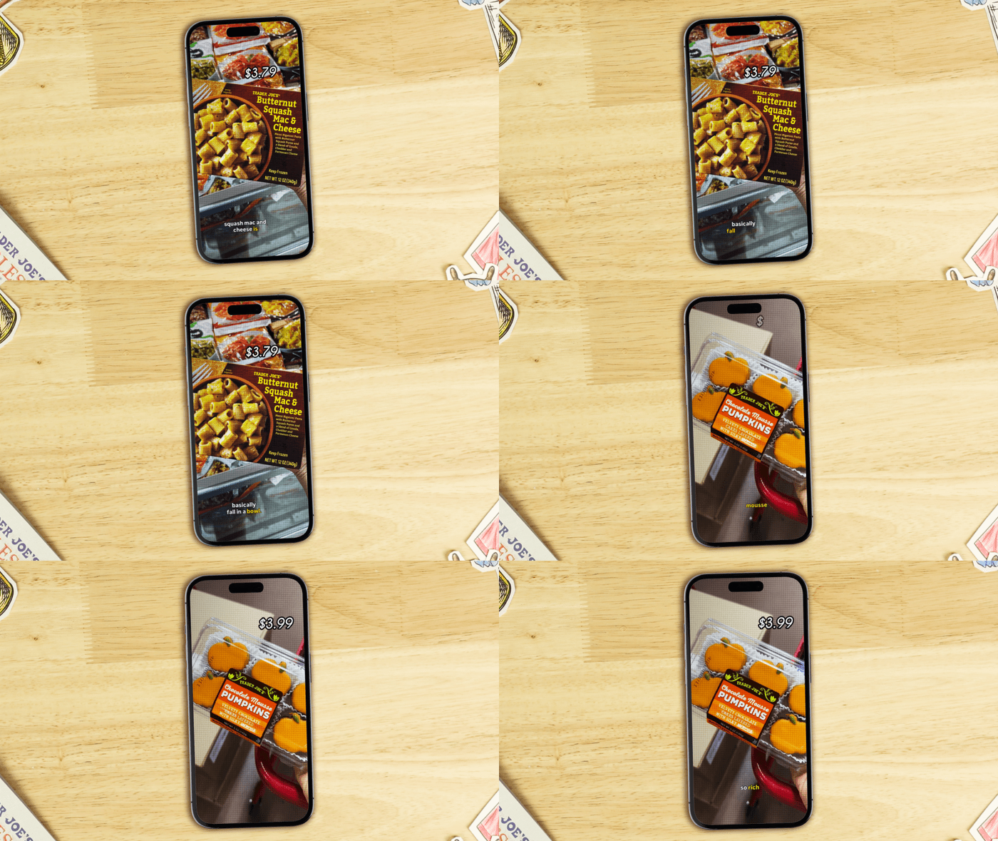
Oftentimes, videos included a lot of archival photos and footage. Giving a variety of options helped break up the repetitiveness of some treatments.
Footage boxes, polaroid photo treatments, and TV table setups shared the same background that the motion designers used for their animations and, if that wasn’t applicable, there were default color options and box sizes.
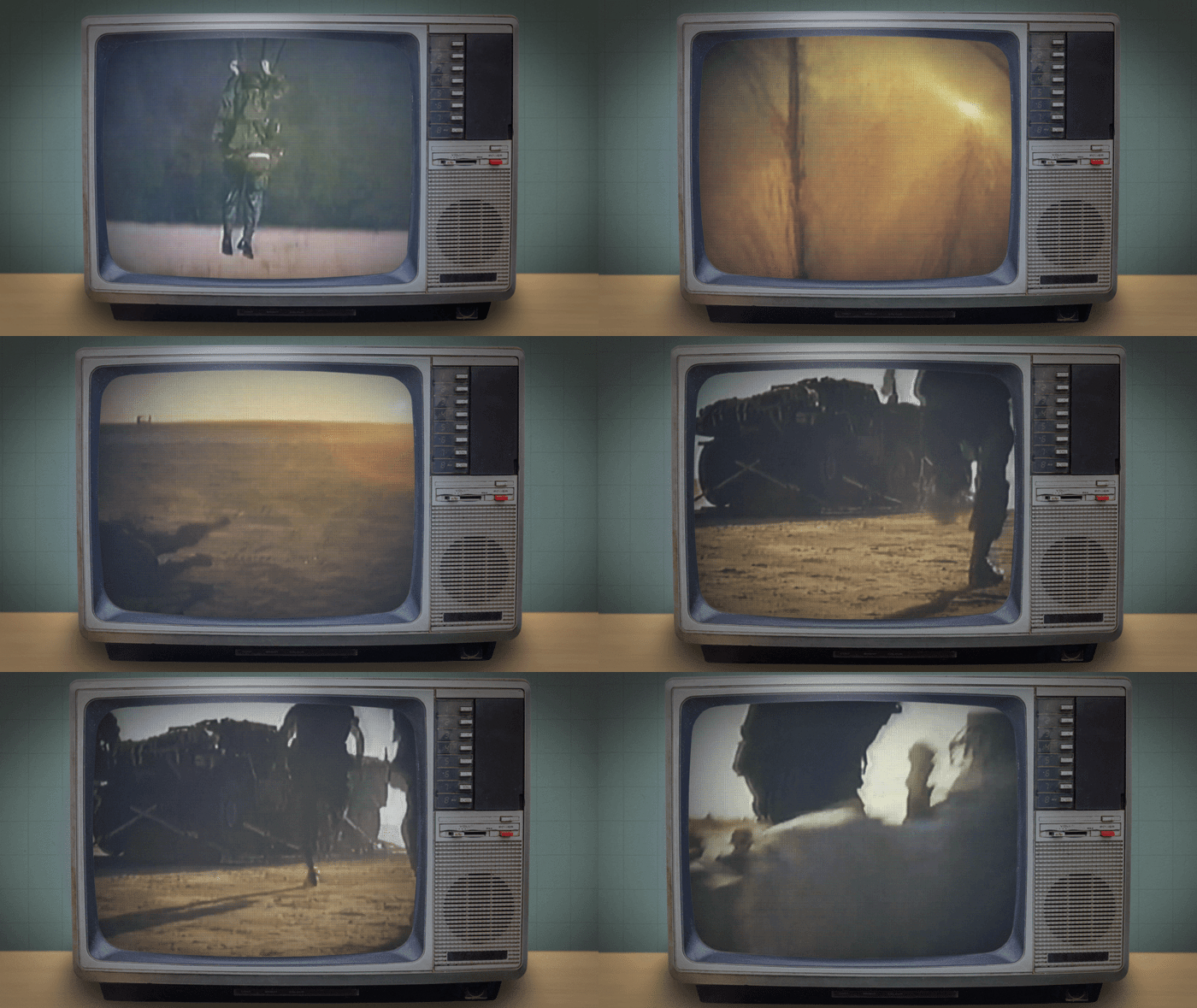
Editors tended to use their own projector-like treatment for archival footage that show-runners really liked, so I built off of that and made a feathered edge projector box that had various sizes. I offered other photo and footage treatments as well that matched the simplistic projector box and tabletop setups.
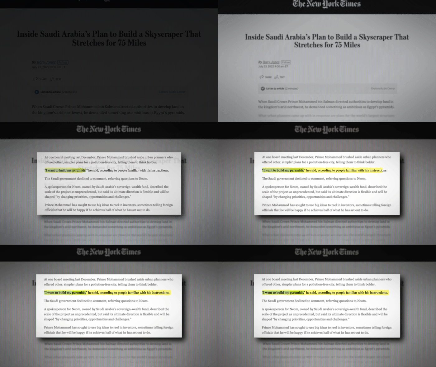
Documents
Producers referenced a lot of research information and data throughout the videos to tell help them report on and tell stories about the people and industries they’re covering.
Having the same document treatment appear multiple times within a certain time frame can make the edit visually boring and exhaustingly repetitive. To break up the edit and give more life into the information that’s being presented, I made a variety of options for editors to choose from.
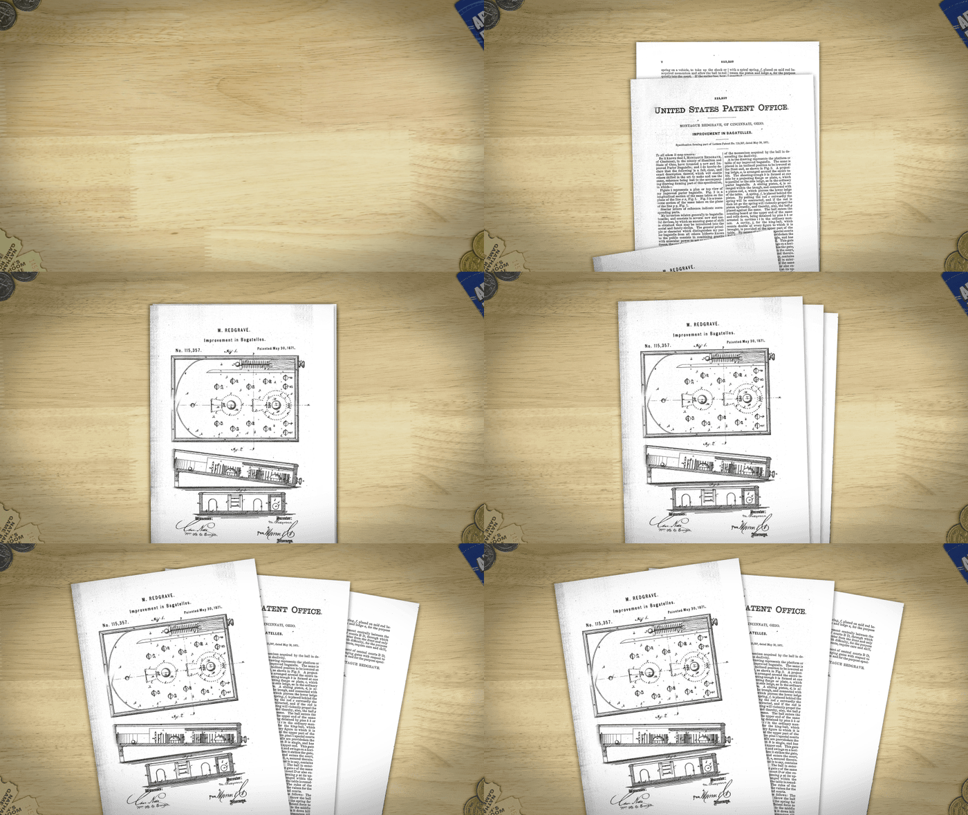
Video editor Clancy Morgan’s tabletop document treatment was a favorite across the team and they wanted an easy way for other editors to make it.
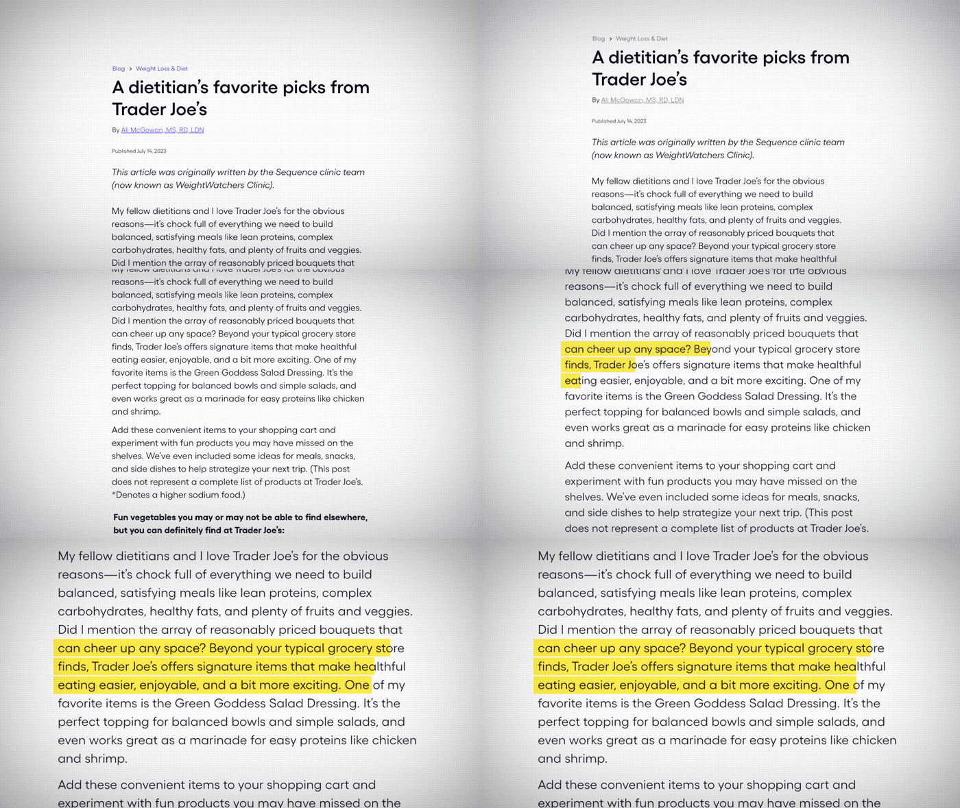
I repurposed the CRT TV overlays from the TV table to make the website page. As an After Effects template, I gave editors a variety of movements to choose from.
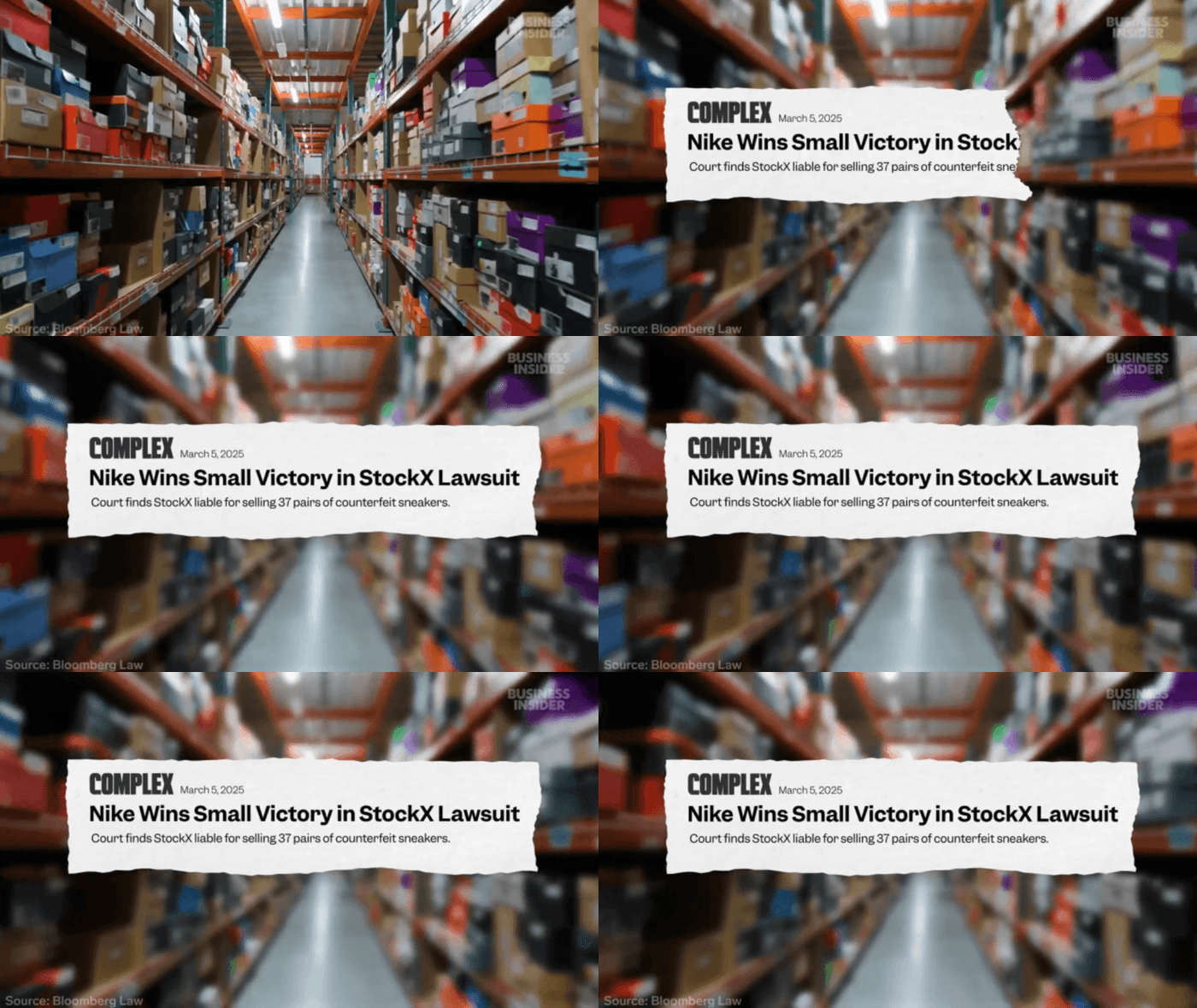
Former fellow Sam Parra Pulido designed this newspaper treatment that the team liked, so I built a MOGRT version.
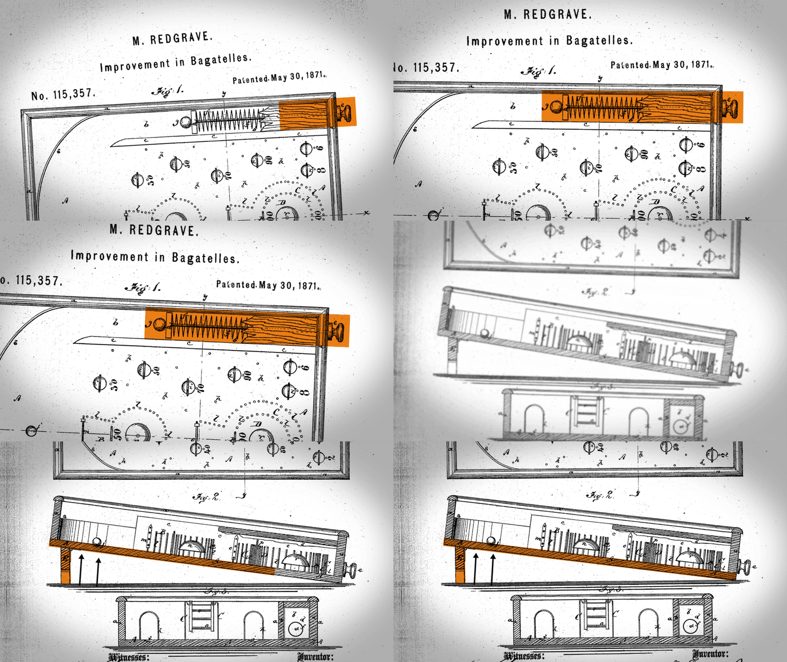
The document fan out would sometimes be followed by a close up of the pages. To make it easier for an editor, I made these Premiere templates.
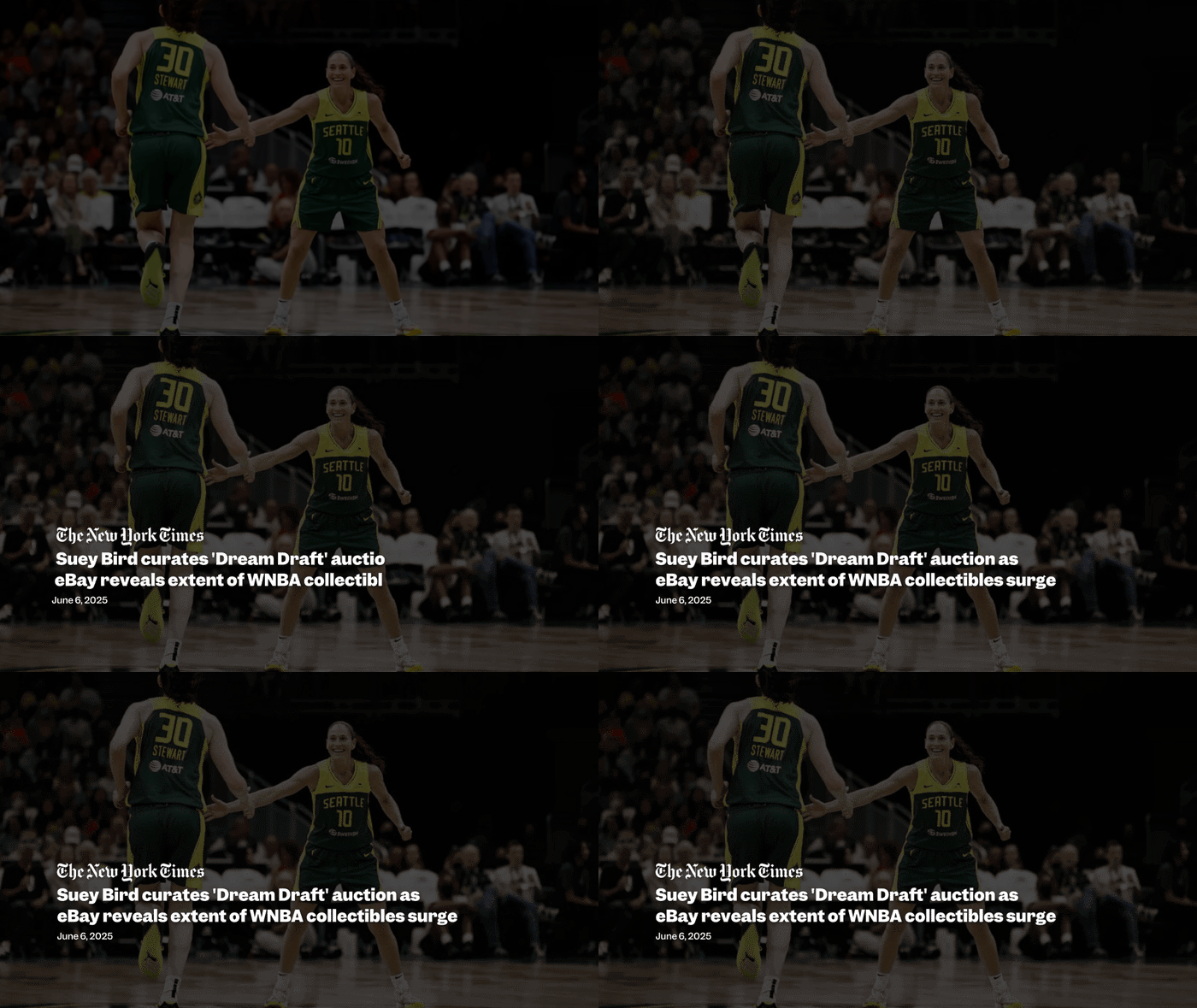
Also repurposed my article headlines MOGRT from Business Insider Today. I cleaned it up, added the new font, and the new in/out text animation to match the rest of the text on screen.

Fellow motion designer Marco Secci designed this for View From Above and built a MOGRT for After Effects users. I cleaned it up and built a new MOGRT for editors in Premiere utilizing a Photoshop template for the article pieces.
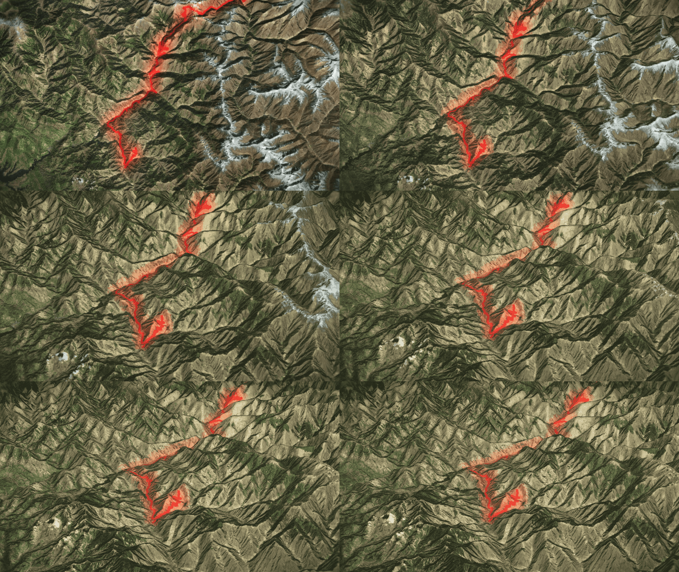
Maps
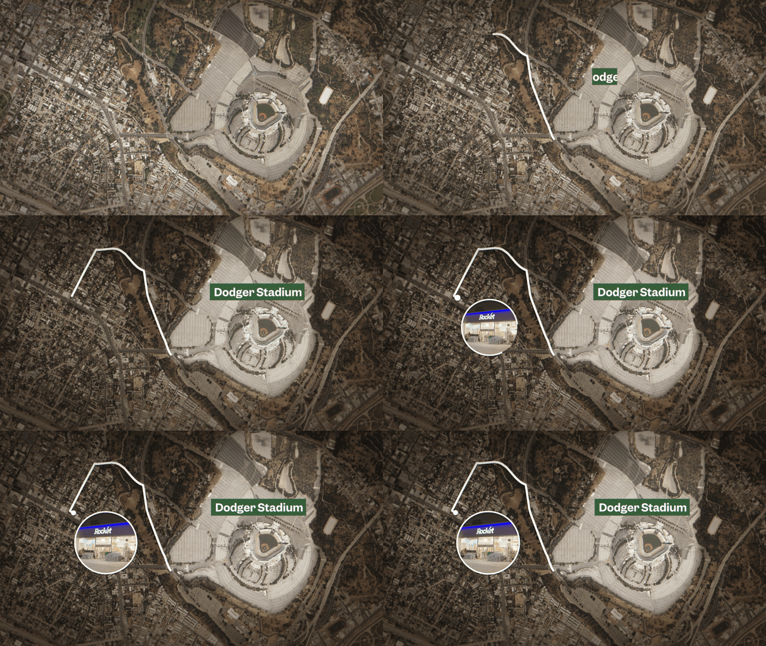
Business Insider used the Geolayers plug in to make stylized maps. For 3D stylized maps where elevation was an important factor, I made a pitch for Mettle Freeform Pro and got the green light to purchase it.
For all maps, they wanted to use a more natural earth and satellite style.
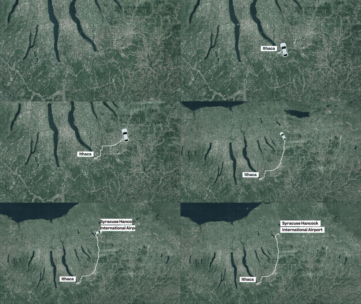
Vertical Videos
With the rebrand, Business Insider also put more focus and time into their vertical videos. I housed vertical versions of all the text on screen within those main text on screen MOGRTs.
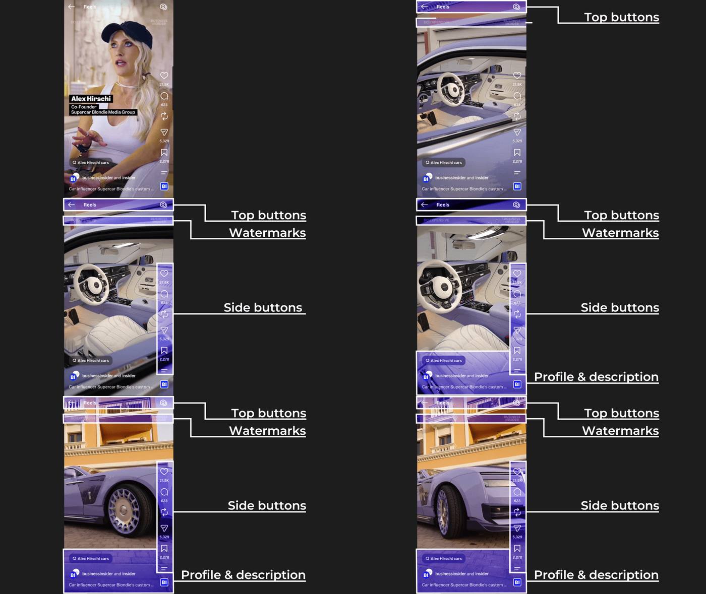
Yearly updates to social media platforms also meant new safety margins so that icon buttons and description text wouldn’t block out important parts of the footage and text on screen. I went through a lot of trial and error uploading test videos to Instagram, TikTok, and Snapchat until I could find one that would universally work across platforms. To brand those videos, I also included a watermark logo and series name below the top edge of the safety margins.
Vertical Captions
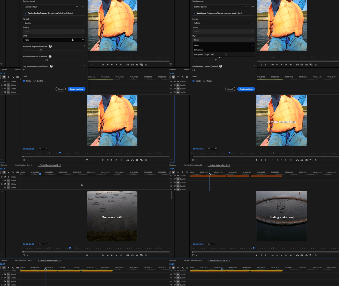
More people watch vertical videos without sound, so I created a caption style in Premiere. It had a set font, font weight, drop shadow, position, color, and size. When editors added it, all captions automatically changed to that style.
YouTube Thumbnails
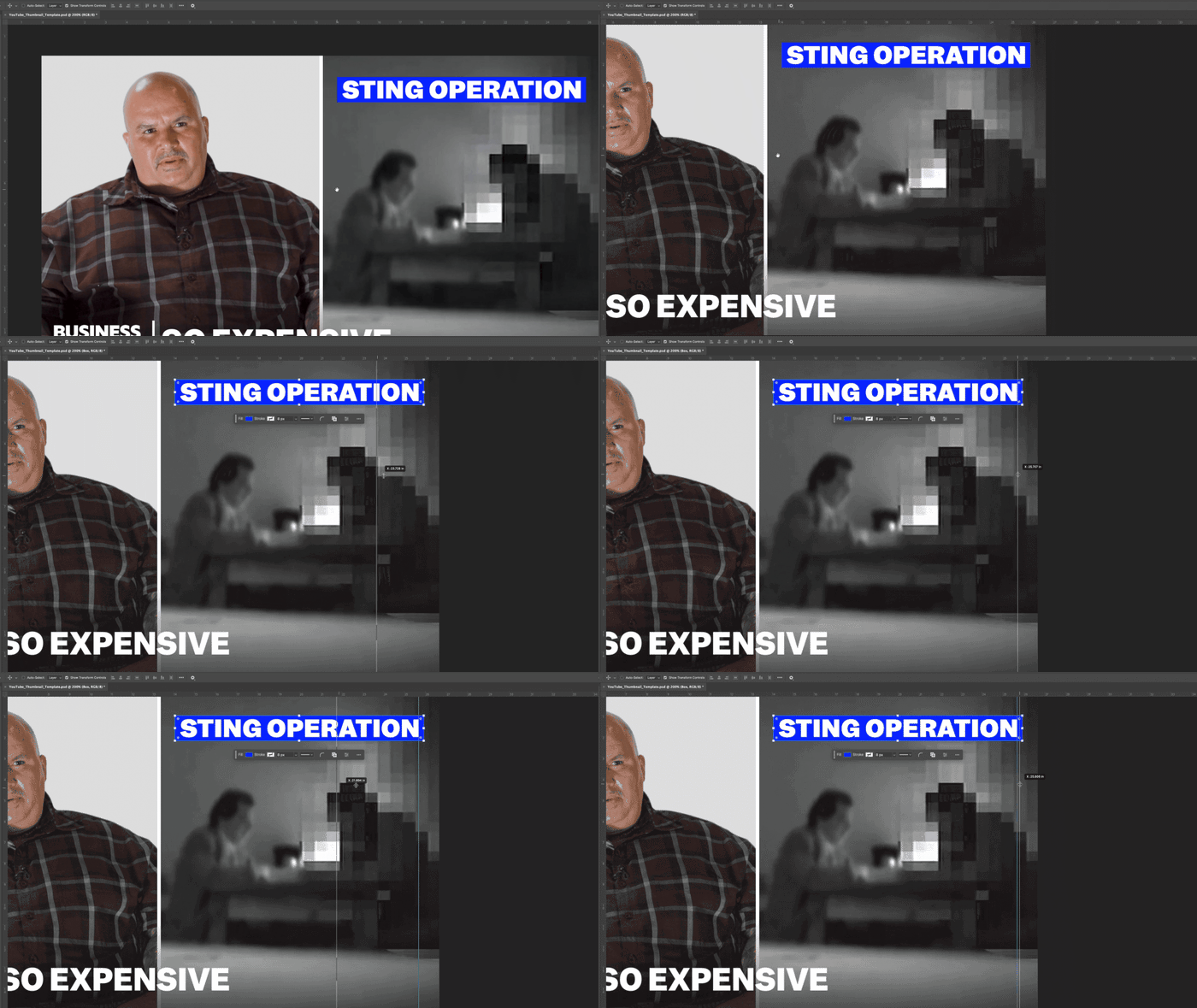
To really reign in this new branding for video, I also made a set of Photoshop templates for YouTube thumbnails in both a regular resolution and 4K.
Each were setup with text, text boxes, arrows, circles, lines, all of the series names to choose from, Business Insider logo, and a split screen image option.
These templates also became a part of the CTV streaming toolkit along with a CTV banner Photoshop template I made.

Title Cards
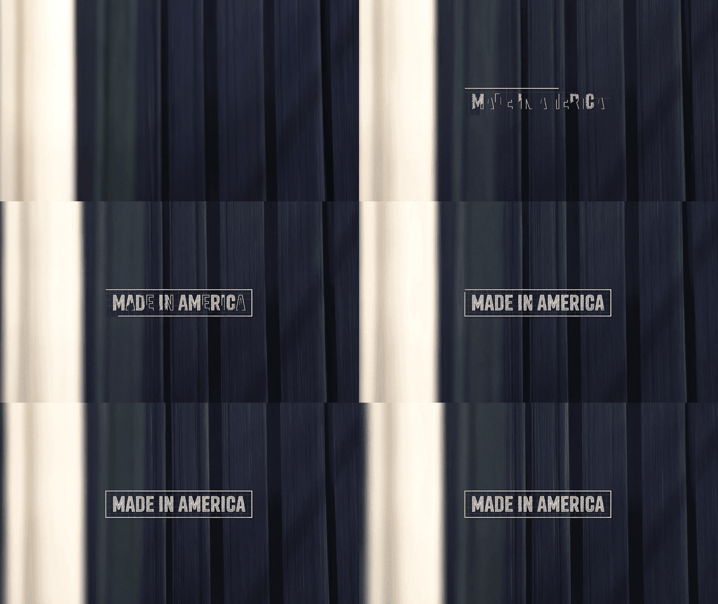
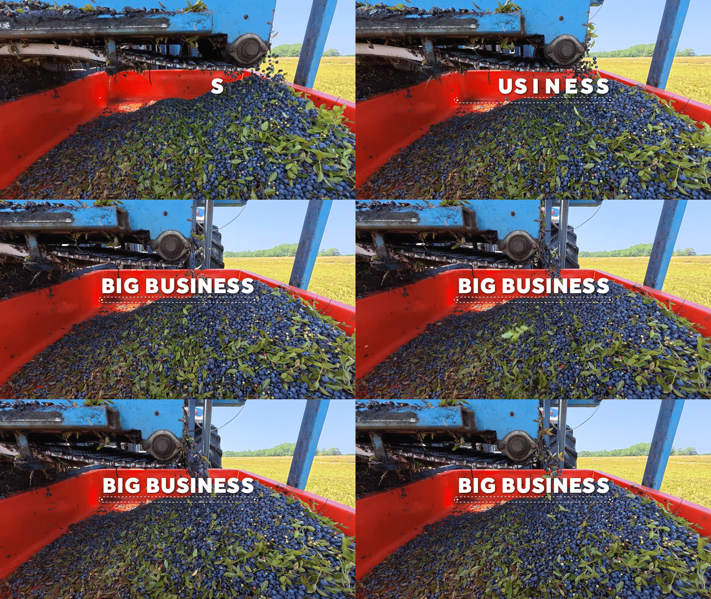
Some series retired and new ones, like Small Business and Made In America, came out of development and needed title cards. Big Business never had one, so I designed and created one for it as well.

Product Room Shoots
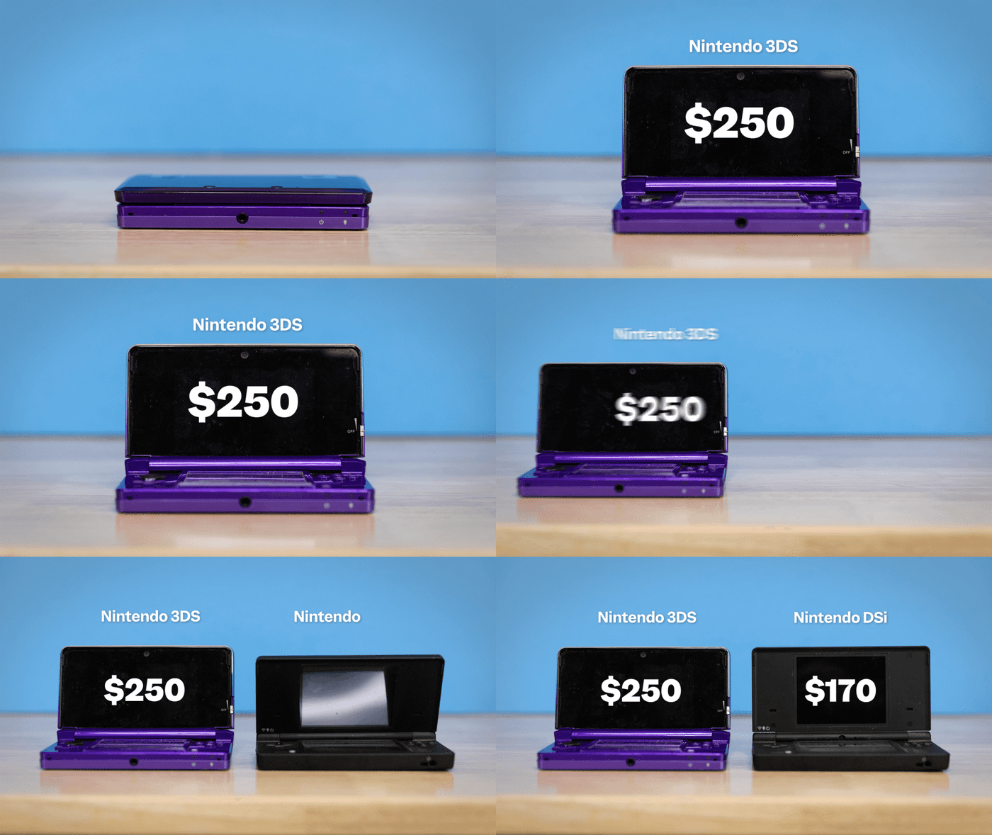
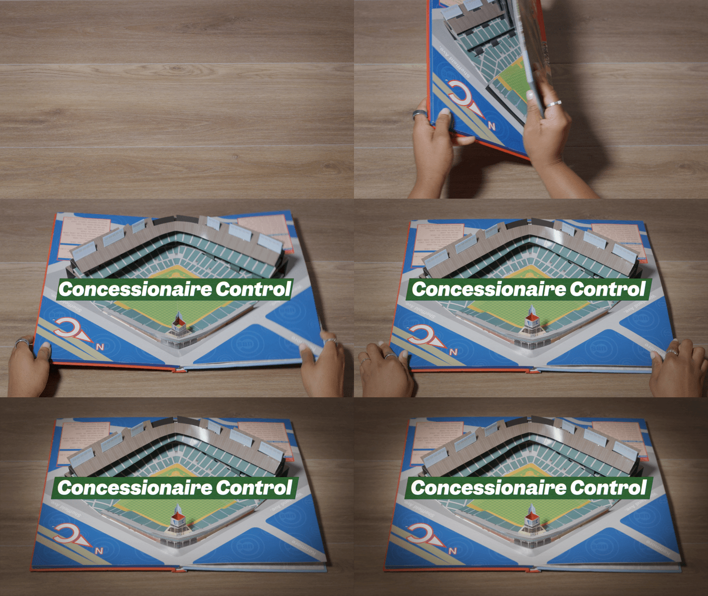
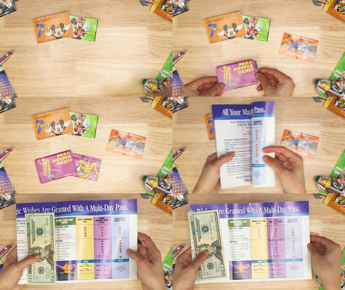
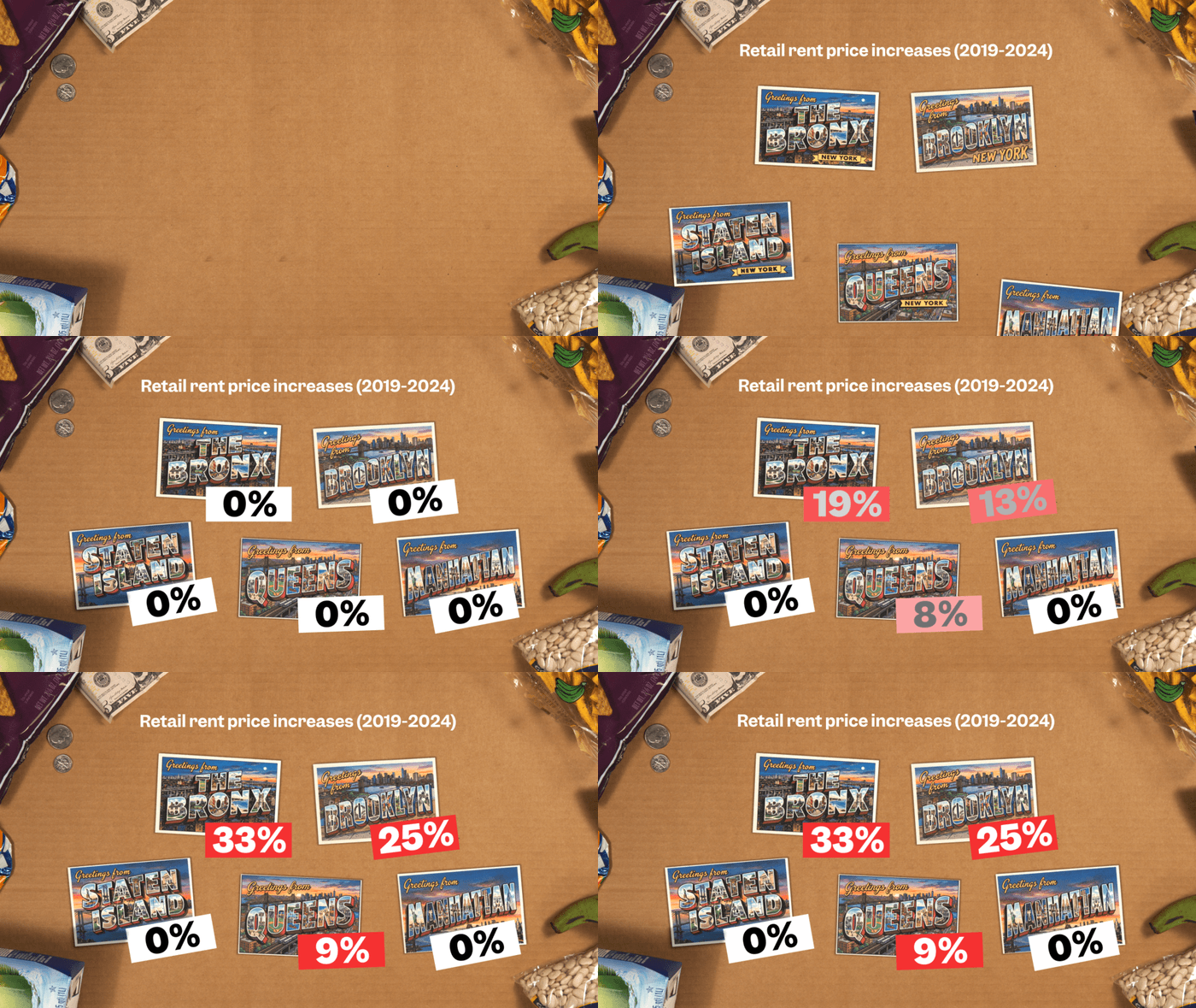
Since working on So Expensive’s Lego video, I’ve filmed tabletop setups with props similar to what the producer did. I also took photos for stop motion for my own animations.
When I was assigned So Expensive animation requests, some potential graphics seemed better as product room scenes, so I went ahead and filmed them in my own home studio. Soon after a few episodes, the rest of the team wanted that for their own series as well. With the rebrand we slowly moved towards this tabletop and props setup for product room shoots. I trained and offered guidance to producers on tabletop setups, props, stop motion ideas and techniques, and possible graphic overlays and chapter headings.